A Conversation with Adam Bartos
A native New Yorker, Adam Bartos became interested in photography at an early age, inspired largely by the work of...
A native New Yorker, Adam Bartos became interested in photography at an early age, inspired largely by the work of Magnum co-founder Henri Cartier-Bresson. Through frequent trips to The Museum of Modern Art, he was well acquainted with the black and white street photography of Garry Winogrand, Lee Friedlander, and Diane Arbus. But in 1974, while studying film at NYU, Bartos struck up a relationship with color pioneer Joel Meyerowitz that inspired his transition away from 35mm black and white work.
Focusing on the contemporary landscape, Bartos infuses everyday scenes — a lone car in an abandoned parking lot, an empty street corner — with iconic importance. Time is an important motif in his work, particularly the way it’s represented in objects and architecture that point to a bygone era. His 1995 book, International Territory: The United Nations, 1945-95, a collaboration with writer and provocateur Christopher Hitchens, illustrated the effects of time on the modernist United Nations building in New York.
The following Q&A with blogger and American Photo contributor Jörg Colberg focuses on work produced for the 2001 book Kosmos: A Portrait of the Russian Space Age (Princeton Architectural Press), and 2005’s Boulevard (Steidldangin), featuring images made in Los Angeles and Paris. — Jay DeFoore
Joerg Colberg: Your portfolio contains portraits of places like Los Angeles or Paris. How do you approach taking such portraits? Do you have ideas in mind when working somewhere, or you just let things happen and see where that takes you?
Adam Bartos: I think it happens both ways. Sometimes I have an idea of a particular place or subject to photograph and occasionally that has developed into a project or book. At other times, especially in the past, I employed the paradigm of the “traveling” photographer. So my destinations were more general, as in cities or countries I had an interest in visiting and photographing. I lived for a time in LA, part of ’79 – ’80, and I visited Paris often in the ’80s and ’90s.
| Other Artist Q&As • Mitch Epstein • Robert Glenn Ketchum • Bettina Rheims • Luc Delahaye • Martin Parr • Taryn Simon • Roger Ballen • Todd Hido • Andrew Moore • Paul Shambroom |
The Paris pictures evolved partly as the result of reconciling all the still and moving images I had in my mind, from Atget to Gene Kelly to Godard, Matisse etc., — all these images of Paris that are the property of western romantic consciousness — with the pleasure and excitement I had of walking the real streets, off season, and photographing in color. In that sense, the pictures are a riff on the idea of “Paris,” but also a sincere response to the city. At a certain point, I realized I was accumulating pictures of gas stations, dry cleaners, and travel agencies, and other characteristic pieces of everyday Paris that had an allure for me — and that became a motif to elaborate.
The Los Angeles pictures were made differently, with 5×7 instead of 35mm, but again, I was looking at a place that carries lots of associations. I didn’t have the sense of working on anything in a particular vein, but just driving and looking for pictures.
JC: So with the Paris photos you ended up somewhat away from the images you had in mind early on. Is that something that happens a lot when you work on a project?
AB: It has to be that way. I don’t try to make pictures that refer directly to anything I have in mind, except in the way of self-editing a group already begun, or deciding where to go. When I’m photographing, I’m responding to what things look like, which is always different than what’s already in your head, even if you’ve managed to find what you were looking for.
JC: When one goes to Paris or New York and takes photos there’s always the risk of falling into the cliché trap. Places like Paris have been portrayed so often that it seems like the whole city has a photo cliché waiting around each corner. Is this something that you were worried about when working there? And how does one go about avoiding cliché photos?
AB: I often choose places to photograph that have some symbolic significance — the UN, Paris, Russian space program, Chinatown, southern California etc., all of which I suppose can be represented as a cliché. Nevertheless, the clichés can contain and conceal verities that are interesting to examine since they signify some kind of agreement on what is pleasing or of value, and possibly, therefore, something outmoded or in the process of disappearing. For some reason, I’m drawn to try and arrest that process. However, the choice of subject matter — which is what we’re talking about here — doesn’t determine the content of a photograph or what it looks like, so you can probably turn anything into a cliché, and the reverse. Reprocessing and re-photographing clichés has been a very rewarding “fine art” strategy, and one that in my opinion, is even more tired and clichéd than it was 15 or 20 years ago.
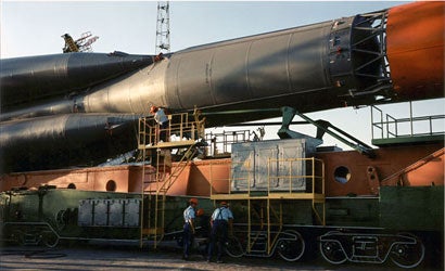
JC: For your “Kosmos” series you traveled to Russia to portray their space program. How did you come up with the idea? And I could imagine taking photos there where things are so different from what we’re used to in the West must have been a challenge. How did you approach that series? Was there anything that you would not have done elsewhere, or was it “just” another project to do?
AB: I had the idea after coming face to face with artifacts from the program on display at Sotheby’s in New York in 1993. I was bowled over by the extraordinary aura these things emitted, and I decided to go, there and then.
The logistical aspects of doing this project were truly daunting. I was incredibly fortunate to find a uniquely qualified person who helped me in Moscow, or I never would’ve been able to complete it. I also went as a complete space novice and so early on, I had no idea of how to organize or prioritize my program. Also, there wasn’t a clear theme. Since you’ve asked me about clichés, the space program is endlessly commemorated in Russia and I wanted to skirt the obvious kitschy stuff — monuments and pictures of cosmonauts. On the other hand, the subject itself is so vast, and I wanted to address it in a way that I felt was appropriate to its scale. Eventually, I structured the project by focusing on the legacy of the space program’s legendary “Chief Designer,” Sergei Korolov. This helped me to tie a lot of varied subjects together, portraits of retired engineers, domestic interiors, manufacturing plants, the launch site in Kazakhstan, etc. The time represented in the book (KOSMOS) is elastic, it jumps around from a 1950s era switchboard to a modern rocket launch, and sometimes it might be difficult to tell whether what you are seeing is abandoned, in active use, or part of a museum — but that’s really how it is.
It was an extraordinary project and I probably managed to do it in the last moments that it was possible to have access to that world. Many of the gentlemen I photographed have died since, and during the Putin years everything has been closed back up.
JC: I read that some of your photography was done in the 1970s, a period that more and more people are interested in now, since it is the era when color entered into the fine-art photo world. I’d be interested to learn a little bit about your thinking, your approach to photography back then — who influenced your work? And how has your approach changed, given that now color is widely accepted, and now people are instead debating whether digital photography should have the same status as film?
AB: I was taking pictures in black and white in the early ’70s. I was fascinated with [Magnum co-founder Henri] Cartier-Bresson and I went to The Museum of Modern Art often and was well acquainted with Winogrand, Friedlander, Arbus, etc. While I was a student at NYU film school, I co-founded a “friends of photography” club and we decided to project slides — partly in order to stay out of the darkroom and concentrate on making images, and also just for the fun and beauty of seeing the color and large scale. Around that time (’74) I came across some Joel Meyerowitz pictures published in ArtForum. They excited me greatly, and I looked Joel up in the phone book. Very generously, he introduced me to some of his students, who were making color prints, and that began to change how I approached making pictures. I was also becoming familiar with Eggleston’s and Shore’s work, and my friend Richard Pare was showing me astonishing 19th century material he was collecting for what became the Centre Canadien d’Architecture. Also, looking back, I had a fabulous film education in New York in the ’70s — it was possible to see everything, and I tried to. That was the thinking!
The question about digital versus film is a non-issue. It’s one choice of many made in the process of making something — and it doesn’t affect the final quality of the work — unless it was the wrong choice!
JC: When you compare the photo scene back in the ’70s with today — how have things changed? And what do you think of the role of the Internet?
AB: I think that in one way the Internet and electronic photography are making people more sophisticated about image-making because they are doing so much more of it, and there’s no technical challenge to making a picture that “looks good.” But then, as PL di Corcia said, even more “people think photography is a foreign language they can speak” and so there’s a kind of emphasis, also enabled by electronics, on making pictures that are heavy on production value, size, weirdness, etc. etc. to distinguish themselves in the ever growing art market. What worries me is that the audience for photography may lose the capacity to make distinctions about what was formerly appreciated as a circumspect medium — although, to be honest, I’m not sure that’s happening.
–Jörg Colberg is founder and editor of the fine-art photography blog Conscientious. He works as a research scientist at the University of Massachusetts, Amherst.