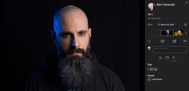
What Do You Think of the Most Recent Flickr Photo Page Redesign?
The photos keep getting bigger and the navigation looks a lot better

Since their major overhaul last year, there has been a lot of discussion about the direction in which Flickr has taken their photo sharing service. Just recently, their latest photo page redesign out of beta and rolled it out to the entire user-base. What do you think of it?
The new design provides an image that reaches the top, bottom, and far left edges of the frame, which is good because it keep the emphasis firmly placed on the photo. You get thumbnails for other images in the right-hand column, as well as a place to add comments and favorites.
One the whole, I think the page looks a lot better than the one that came before it.
The method for downloading photos has changed a bit. Rather than right-clicking and picking a photo size, you now have to use the navigation in the right rail of the page and find the download options. So, you can still get to the original or downloadable photos. It just takes a few more clicks.
The pages seem to move fairly quickly, which was one of the complains about the old version of the page, but it’s tough to know for sure without being able to test both right next to one another.
Overall, how do you like the page? Does it look better? Is it faster? Leave your feedback in the comments.
