Flickr Adds Unavoidable Toolbar, Users Freak Out
More changes to the popular photo service getting mixed reactions
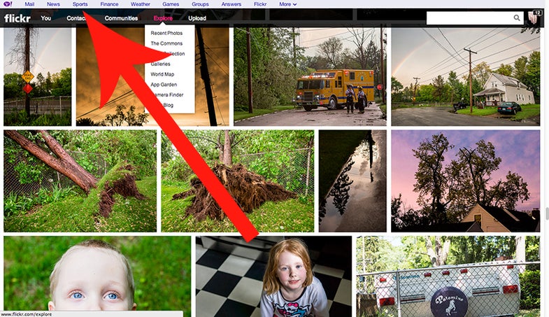
The new Flickr has been live for months now, but the reactions (or backlash if you will) is still going strong. The latest cause for uproar is a new toolbar that sits at the top of every page, subtly suggesting that you make your way into the other Yahoo! services. Predictably, some people are very upset about it.
Full disclosure: I didn’t even notice the tool bar until someone pointed it out to me. It’s very much like the dark grey toolbar at the top of every Google service, and I stopped noticing that long ago. But it is there, and it is taking up screen space. You also can’t get rid of it, even if you’re a pro user, and that’s a point of contention with many online.
If you want to spend two minutes crawling the Flickr user forums, you’ll see plenty of angry folks venting about the change. Personally, I don’t find it all that problematic to simply add the bar, but I do think the timing was something of a misstep. With some users still on edge about the initial change, I think it would’ve been better to add it right at the outset of the redesign. Or, at least offer some kind of new feature that the average user could easily appreciate to mitigate the negative response.
Ultimately, I’ve been a Flickr user for a long time and I actually like the new format. I’ll readily admit that it has shortfalls, but I think it’s more appealing now and I haven’t really noticed the slowness for which it’s often criticized.
That said, I think Yahoo! would be best served to lay off the changes for a little while and let things calm down. Unless they’re going to add things that will be universally applauded (like the ability to export images in big bunches), they’re likely going to see more backlash.
What do you think? Now that we have some distance between present time and the big launch of the new Flickr, have your thoughts about the service changed?
