Video-Sharing Site Vimeo Getting a Full Makeover
One of our favorite video-hosting sites gets a new look and some long-awaited features
By now, you’re probably locked into a photo sharing site, but as the line between photographers and cinematographers continues to blur, choosing a video-sharing service has become increasingly important. Vimeo was already one of the best, but they’re hoping a full redesign of their site will help attract even more people.
They have done some substantial work on the back-end, optimizing the code so it’s easy to develop for and compatible on a wide variety of devices. But, perhaps more important to the average user, they’ve given the whole thing a facelift, making the actual video more central on the page.
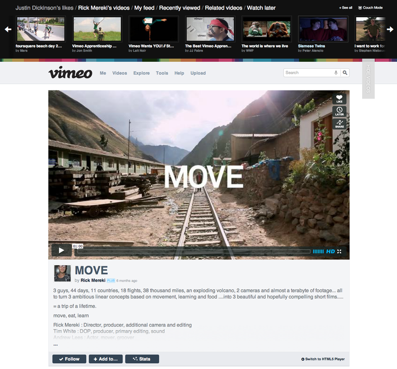
As you can see from the screen shot, the video itself is now much bigger on the default page, making the caption easier to read as well. Vimeo already had a reputation for offering better video quality than many of their competitors, so it seems they’re trying to show that off a bit.
They’ve also added some features that have been conspicuously absent in the past, like a recommendations engine for suggesting related videos and more robust search options. You can also now upload more than one video at once, which is a big step in the right direction for them.
The social aspects have been cranked up as well. Now you can “follow” users and keep up to date on their videos in an increasingly familiar feed format. On the flip side, they’ve made the privacy controls more granular, so you can be selective about how you share your history and preferences. That could be important depending on your taste in videos.
You can sign up to be part of the closed trial, but it’ll be rolling out to everyone in the next couple weeks. So far, it’s looking pretty good.
Are you already a Vimeo user or do you host your videos somewhere else? Will this redesign prompt you to give it a try?