Why does the White House Christmas portrait look so weird?
There is a surreal quality to this year’s Christmas portrait and it likely comes down to lighting.
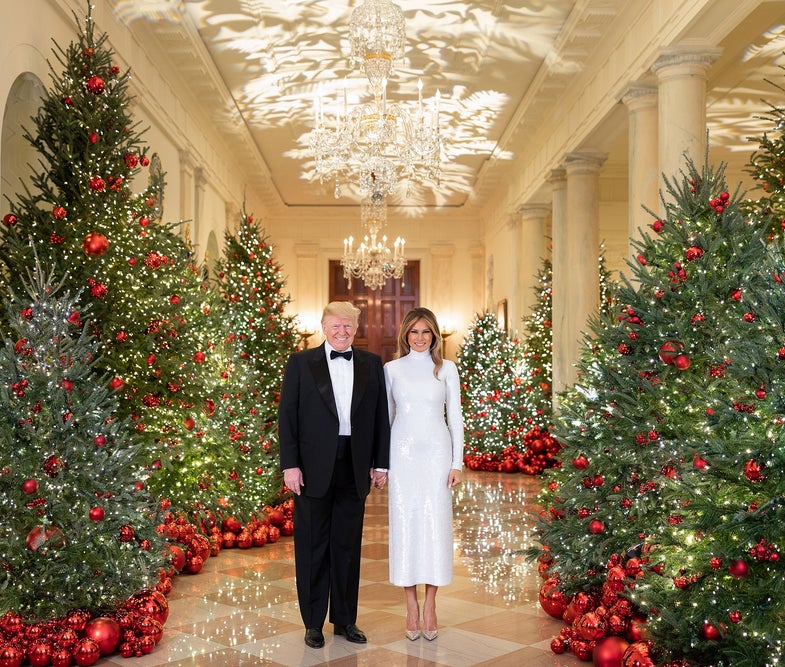
Yesterday, the president and first lady released their official holiday portrait from the extravagantly decorated White House. It generated a predictable amount of political fawning/backlash, but another controversy sprung up around it. The couple looks slightly out of place in front of the piles of shiny decorative balls and meticulously lit trees. They almost look like they were added to the scene in post—or “Photoshopped” as so many internet comments suggest.
I reached out to the photographer via DM to find out the exact method for the portrait and haven’t heard back, but I do have an educated guess about why the image looks slightly odd at first glance and it mostly comes down to lighting.
The couple is lit very evenly, which suggests a large light source like a softbox, an octobank or something similar. You can tell the direction from the shadows, especially under Melania’s hair, which shows the direction of the key light rather nicely.
The key light is slightly cooler than the ambient light in the room, which makes the people look different than their surroundings. Compare the red Christmas balls near the couple on the left versus those on the right. There’s a subtle-but-clear difference in their color temperature.
In order to let in the ambient light from the decorations, the photo was likely shot through a relatively wide aperture. That gives the lights on the wall in the background and to the sides of the hallway plenty of opportunity to throw those highlights on the first lady’s hair, which is forming kind of a makeshift rim light, which photographers often use to separate a subject from their background.
All of this sounds pretty standard, so why does it look so odd?
A weird aspect of this photo is that it lacks some of the typical indicators we’re used to seeing when a photo uses an off-camera flash or light source. The couple is offering up some big, squinty smiles that push their cheeks up and make their eyes small. As a result, we’re barely getting any kind of catchlight, which is what we call the specular highlight that usually appears in a subject’s eyes. Look at most advertisements or magazine portraits and you can see the lighting reflected in the subject’s eyes. That’s not the case here.
Related: Pop Photo’s 2018 Gift Guide
Because the background is a long hallway, we’re also not getting anything in the way of background shadows from the key light. Take a look closely at the feet in the picture and you can clearly see a shadow that indicates a light from camera left.
Lastly, the color balance between the ambient and the flash are close, but not exact. If the lighting in the room were more orange—like when you compare typical tungsten bulbs to the bright white light of a flash—I think it would appear more natural. A slight warming gel over the flash itself also may have helped balance the key and the ambient completely, which would have made it look more natural as well. Though, this shot was likely taken on an extremely short time frame, so tweaks like that can be difficult. The color balance on the couple is correct though, which is the most important place to get it right.
Beyond the lighting, there’s a lot of other things you can analyze in the photo. The pose, for instance, makes it look like a lighting test because of the lack of real interaction between the couple and the lifeless, hanging arms. The smiles aren’t the kind of natural expressions that make a photo feel genuine, but that, again, could be simply a function of a super-short timeframe with which to get a usable shot.
I’ll update this post if I hear back from the photographer.
