Visualization Scientist Robert Hurt Takes NASA’s Space Images And Makes Them Beautiful
He strikes a crucial mix between aesthetics and hard science
Even if you’re not a huge space nerd, there’s a good chance you’ve been charmed now and again by some of the amazing images captured by NASA from time out among the stars. But, making a space image that’s both beautiful and scientifically accurate isn’t a simple task. Astronomer and visualization scientist Robert Hurt works at the Caltech’s Infrared Processing and Analysis Center and is tasked with taking raw data captured by insanely complex telescopes and translating them into the images we all love to share via social media. It’s a delicate mixture of fine art and hard science that has taken him years to master. Here’s how he does it.
It’s not often we get to interview astrophysicists here at Popular Photography. Can you share your exact title and job description?
My job now is a catch-all term of “visualization scientist” for NASA’s Spitzer Space telescope and other missions. Effectively, I help create the visual side of our communications. A large part of it is taking research data sets observed by the telescopes and turning them into publication quality photography based on the research.

What kind of background do you have? Surely there are lots of years of formal education involved.
My background is in research astronomy and after a couple of post-docs, I ended up gravitating toward service science rather than classic university research. I started working at the infrared processing center here, which is a science center for some of NASA’s astrophysics missions. I have a long background as a photographer and a digital artist. That’s a hobby I’ve had since I was a kid.
The images you work on seem to strike a fine balance between art and hard science. How do you maintain that relationship?
My job is to take the imagery and make it a beautiful public-facing thing, but one that’s actually grounded in the underlying science. We’re not going to cross the line of changing colors or fabricating things in the image just for the sake of being pretty. Everything there has to be grounded in the reality of what we’re observing.
What do the astro images typically look like when they hit your desk?
The primary difference is that our images intrinsically come back as monochrome raster images. Our detectors are only sending back one channel of information at a time. Sometimes we will use a filter that in front of the detector to restrict it to one part of the spectrum like a photographer would. A lot of times, we actually have individual detectors that are optimized for different parts of the spectrum. It’s sort of like having a 3-chip video camera with one sensor dedicated to each red, blue, and green.
So, most of the time you’re starting from square one in terms of applying color to these black and white images?
We have to assign color to the different channels that are coming from the telescope. Back in the ‘70s a phrase called “false color” was coined to refer to astro images. It was a terrible term devised for a very reasonable purpose. The problem with a term like that is that it implies that there’s something false about the image or the colors.
I actually prefer to think of it as a process of translating color rather than falsifying. What we’re doing is taking channels of information at different wavelengths from outside the visual spectrum and remapping or translating that information back into colors we can see. I think of it as the photographic equivalent of taking a text that’s written in Mandarin and translating it into English for people who don’t understand the original text.
The instruments you’re using are much more complex than a commercial camera, though, so how do you translate that into something the human eye can understand?
Most astronomical data sets are intrinsically what we would consider HDR data sets. So many of the things we observe have really wide dynamic range. You can have brilliantly bright stars embedded in very faint diffuse nebula that surround them. A properly gathered data set can have a dynamic range of 10,000:1 or 100,000:1 just by the intrinsic nature of the sky. We have techniques for processing these high-dynamic range images so we can get the full benefit of the data, just like a photographer who takes a photo on a bright day and doesn’t want to burn out the sky.
Most importantly, we want to preserve relative lightness in the frame. If one area is brighter than another, we want to make sure that we’re reflecting that. Even if we have to do some mathematical adjustment beforehand. We want to be able to look at something and if there are twice as many hits on a pixel, we want to know that it’s twice as bright as the one next to it so we can do the science on it.
How do you decide which visible colors to apply to the images?
If we have three detectors, then it’s a straightforward process. Most frequently, what we do, is try to preserve the relative ordering of the light. We know that red light has a longer wavelength than blue light, so regardless where it fell on the actual spectrum, the data with the shortest wavelengths will be mapped into the blue channel, and the data set with the longest wavelengths will go into the red. The intermediate will go in the green.
In a way what we’re trying to do is reconstruct this translated color and preserve that relative sense of red to blue. You’ll find that most of the astronomical images you see, whether it was done in infrared or ultraviolet, or in the visible spectrum, it’s often built around this metaphor as long as you don’t end up with something that’s hard to understand or see.
So, even if you were to make the trip up into space, you wouldn’t see the same colors from the images in the real world?
If you were in space, what you would see is dark because your eyeball doesn’t see infrared light. Even the astrophotography that’s done in the visible light spectrum, it’s still not what your eyeballs would see because it’s all way too faint. We have to do long exposures. At best, you would see a black and white haze if you could see it at all. But, Just because it’s not reproducing the experiencing your eye would have, doesn’t make the color false. The colors are real, they’re not colors that you can see, but the change in proportion is actually still real. We’re just finding ways to represent that.
What format do you use for the captured images?
In astronomy there’s a format called FITS, which stands for Flexible Image Transport System. It has been around since the ‘70s. That’s basically an astronomy form of a TIFF file. It has its own header information that we can use to include the calibration information that we need to understand the data. It’s just another way of rasterizing a binary data set.
Where does the data go from there?
There’s an application called FITS liberator that I use. It was originally built as a Photoshop plugin because those of us in astro image processing had a conference many years ago and one of the questions that kept coming up was “How do you get FITS data into Photoshop?” Everyone had a different formula and it was really clumsy. A lot of times it could only accommodate 8-bit imagery and it’s really much nicer to work with 16-bit because of the dynamic range.
We actually got a small group together and drew up the specs and developed a plugin that would read the FITS data, let you do some basic mathematical transformation to recover the dynamic range, and then output it. It’s not a stand alone application that puts out a TIFF file.
From there, do you go into a more traditional image editing program?
I tend to work in Photoshop. I’ll load in each grey scale image in its own group and apply a color to each group using a color swatch. You then use the screen transfer blending mode to combine all the colors together. Of course, if you’re just working with red, green, and blue, that’s overkill. You can just as easily open up the three channels and paste them into the individual color channels as a starting point.
What happens when you have a different number of channels to work with?
Often we’re working with only two channels of data or sometimes four or five channels of data, so it doesn’t necessarily map easily into RGB. By creating a channel from each group of information from the telescope and then assigning it an editable color individually and then applying them all together using a blending mode. That gives you an opportunity to take other datasets and apply them to intermediate colors.
For instance, there’s a mission called the Galaxy Evolution Explorer that I did the image work for, and it was only near ultraviolet and far-ultraviolet. That’s only two channels. The technique I would use for that would be to take those two channels and use two complementary colors to represent them–maybe red and cyan. Then, I’ll use the linear burn blending mode. The image then goes to white where they overlap, but breaks out into contrasting colors where there’s a difference.

What if you have more than three channels?
In that case I’ll add intermediate shades like reds or oranges and build them up so channels with similar information get similar colors. It gives you a more aesthetically pleasant range of color.
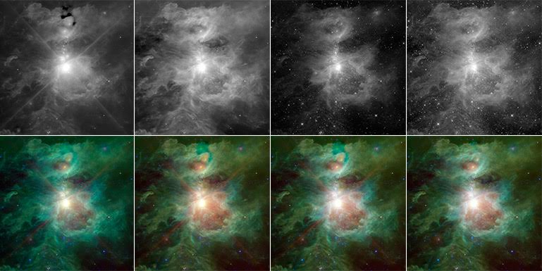
The Orion image uses four channels of information. The two shorter wavelength channels have been applied to a pure blue and a cyan. Now, that actually works well for this kind of dataset because both of those channels are primarily showing the light from stars. If I just averaged them together and made them both blue, you would get these pure blue pinpoints in RGB, which looks terrible and it’s not a very good representation of the stars. So, by taking the opportunity to blend a little bit of cyan in with that blue, it pulls those stars out and makes them easier to see and print, but they still blend together very nicely.
The third channel is primarily related to the glow of organic dust molecules that are being illuminated by starlight. They have a wavelength of about 10 microns or so, and that we apply to the green channel. That phenomenon–the soft glow of dust particles–looks green. Then the red channel is also coming from dust, but it comes from the intrinsic thermal radiation of dust. As dust warms up it actually starts to radiate on its own. So, the difference will indicate where the dust is hot versus where the dust is simply being illuminated by the ambient light. Those colors actually tell you a science story as well as being aesthetically pleasing.
Have you been following the images of Pluto coming back from the New Horizons mission?
Yes, that has been terribly exciting. I’m not directly involved with that, but we’re getting a completely fresh look at something that we have never seen before. Of course, they have to do some interesting tricks with their datasets as well, especially with the early images that came down.
Can you expand on the techniques they have had to use?
They have a primary imaging camera that’s monochromatic and it’s creating these nicely detailed black and white images of Pluto and its moons. They do have detectors that can recover color information as well. That has been done at a much lower resolution than the crisp black and white images. They’re very bandwidth limited. In fact, they’re bandwidth is about what you’d expect out of early AOL dial-up. It’s going to take them roughly 16 months to actually transmit all the data that they have collected in the past few days to earth.
As a result, they send down a low-resolution image with the color information for Pluto and the moons and then they added that color information onto the crisp black and white image. So, there’s sort of a synthetic technique to represent the colors of it, but it’s not a direct red, green, blue image as you might expect.
Do you do any other cleaning up of the images beyond the color?
There is a layer of glamor photography processing that goes on. The datasets, as you might expect, aren’t always perfect. There are bad pixels on a detector or cosmic rays can actually hit a detector and cause a glitch that’s not related to something that’s in the sky. The telescopes themselves can have known artifacts. If you have a really bright star in one part of the frame, it can create a glint that will show up in another part of the frame. It’s the astronomical equivalent of a lens flare.
The sole purpose of the editorial clean-up is to remove all of these known instrumental defects in the image. When people look at these images, they sometimes really study every fine detail. So, if you have a little thing in there that you know is just a glint from a bright star, but it looks like something in the field, people will think it’s a weird planet or something floating off. They might compare it with other images of the same object and think they have discovered something when in fact it’s an instrumental effect.
Astronomers understand these and work around them, but for the public, you want to take out what’s essentially the equivalent of a scratch on the negative. You don’t want to remove anything that’s actually in the data set. You want the most accurate possible representation of the data set.
Do you still enjoy traditional photography in your free time?
Yes, but I don’t do it nearly as much as I have in the past. I have a particular fondness for doing airplane photography when I’m flying. My little hobby is to try and do stereoscopic photography from an airplane. As the plane moves across some terrain, I take multiple pictures and then I can reconstruct them into stereoscopic pairs. It’s great fun.
