Spotlight On Jason Langer
The fine art photographer talks about his new book, "Secret City," his years assisting Michael Kenna, and why he still prefers gelatin silver prints to digital.
During Jason Langer’s years as an assistant to and friend of Michael Kenna he learned innumerable lessons from the master photographer. One of the most important was to be patient.
“Michael said, ‘You can always get a book published too early,'” Langer recalls. “He said the better thing to do would be to wait.”
So for 10 years, Langer carefully explored his idea of noir-ish clandestine cityscapes, refining and reorganizing until his perfectionist sensibilities were satisfied. Finally, he asked Kenna to show the project to a friend at Nazraeli Press. And the waiting paid off – he was rewarded almost immediately with a book deal, for Secret City, which is now available from Nazraeli.
“In my opinion it takes about 10 years to become successful at anything,” Langer says. Langer got his start assisting Michael Kenna for five years, moved on to national editorial and commercial work, and made about 50 percent of his income from printing for Kenna, Arthur Tress, and others. Recently he has been able to cut back to some work with Getty, his own fine art projects, and teaching at the Academy of Art University in San Francisco.
Now it’s his turn to pass on the lesson he’s learned to a new generation of photographers. Langer teaches his students to start out taking photos they have a gut reaction to, then to explore individual fingers or paths that they discover.
“You want to show that you went out repeatedly into the field until you felt like you’d covered it from top to bottom,” he explains.
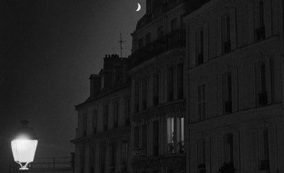
For Langer that meant starting with the photos he’d created in New York beginning in 1994 — moody black and whites of twilit buildings and his actor friend attired like Humphrey Bogart, wandering the lonely streets — and adding a female character. From there, a narrative developed that Langer took to New Orleans and Paris, ultimately creating the Secret City world.
In his eloquent introduction to the book, Kenna writes: “It is a world of shadows and portents, where our intrepid protagonist openly faces and challenges the powers of the night. The word ‘edgy’ comes to mind. It is comforting to think we are [in] control, but these pictures suggest we are not.”
There is no doubt, however, that Langer is entirely in control of his medium. Below he discusses the intricacies of his influences and why gelatin silver is still his gold standard.
American Photo: Michael Kenna describes your images as bringing the viewer to “the edge of danger.” How does this compare to the mood you think this book invokes?
Jason Langer: I experience the photos as more romantic than perilous. I can see what Michael is responding to; most of the photographs depict a singular figure on the city streets in near darkness. In the images there is a mysterious story going on with several undefined characters moving in and out. I actually see the images as two sides of the same coin. Both the danger and the romance in the story create a setting of insecurity. The protagonist embarks on a journey into the darkness, but we never actually see danger; only the suggestion of it. We do see the meeting of two suspicious characters, but it appears to be a secret rendezvous between shadowy male and female lovers. Both danger and romance are risky journeys into the unknown.
AP: The book is printed on very matte, natural paper. How does this integrate with its larger statement?
JL: I love how the book looks and feels. The method of printing and the paper are very similar to the photogravure process. Although the photographs are often confused with those taken by perhaps Louis Stettner in the 1940s and ’50s, the sensibility of the images recalls the Symbolist photographers of the late nineteenth century. Although the printing process looks like the photogravure process originally introduced by Henry Talbot in England and Nicephore Niepce in France, ironically the printing method itself is a newly developed singular-ink process developed by the Toppan Co. in Tokyo.
The look and feel of the printing process reflects the bringing together of several seemingly independent styles and time periods. That is one of the defining characteristics of the photographs in Secret City.
AP: Kenna positively compares you to Alvin Langdon Coburn and early Edward Steichen. How would you compare and contrast your work with theirs?
JL: Michael is perceptively responding to the aesthetic goals of these photographers during the late nineteenth century. Steichen and Coburn both came out of the Pictorialist movement, but soon found themselves amongst a small group of European writers and photographers who were interested in capturing the inner metaphysical and symbolic world, rather than clearly defining representations of the external world. The Symbolists were reductionist in their motives. They were less interested in the details of the material world and instead interested in atmosphere, especially in the subtlety of light found in dawn and twilight. These photographers saw this time as poetic; an opportunity to describe a kind of spiritual truth, where the material is transformed into the immaterial, spurring the viewer to become more introspective. Instead of documentary objectivity, the Symbolists’ goal was that of half-realization, leaving objects and shapes undefined, walking a thin line between reality and unreality.
I think it’s interesting that Secret City should be published now, during a time in which the fine art photography world is immersed in the “Beauty in the Banal” trend — images of disaffected, flat, emotionless people in no particular engagement with their surroundings. Secret City is actually fairly Pictorialist in its sensibility. There are fans of “beauty for beauty’s sake” everywhere; they just haven’t been in vogue in a long, long time. “New Objectivity” is once again in vogue and once again German photographers are in the forefront. The images in Secret City are actually anti-objectivity. They are especially subjective and seek to place the viewer directly into the scenes which are deliberately open to interpretation. The effect of viewing the photographs should be that of direct engagement rather than estrangement and alienation.
AP: Has your style been influence by Kenna? What was the most important thing you learned from your time working for him?
JL: I learned a lot from Kenna. I was always interested in light appearing out of darkness, but working with Michael’s images gave me an appreciation for the balance between foreboding and romance. Most of his images have this duality. They draw you in because of their romantic quality but they almost always give you something to be slightly apprehensive about. There is usually a spiritual and sometimes political aspect to Michael’s work. You have romance but you also have a kind of cautionary tale about the land and man’s relationship to it. In the last couple of years I see a migration in Michael’s work. Where once he was using his ability to romance and frighten the viewer in his depictions of the landscape, he now tends to leave the ambiguity behind and stress man’s harmonious and spiritual relationship with the land, exemplified in his images from Japan, especially in his forthcoming book Hokkaido.
I also learned a lot from Michael about living life as a professional artist — that you can lead a normal, happy life with wife and children and still retain your artistic vision. You do not need to be an emotionally distraught hermit in order to pursue an artistic career. I also learned a lot about working hard and never giving up. As we all know, the world and its constant pressures to make money, provide food for self and family, tend to pull us away from our artistic aspirations. Michael taught me a kind of steadfastness where no matter how often the world pushes you down, as an artist, you must sill get up, stay focused and keep going. This is otherwise known as obsession.
AP: You have said that you still prefer gelatin silver prints and haven’t done any digital imaging yet. Is that still true, and if so, why?
JL: I simply haven’t seen any digital prints that knocked my socks off yet. I’ve never been much of a fan of platinum prints either. I’ve always found them to be flat and dull, even though most professionals seem to think of them as the gold standard for printing. I haven’t seen any digital prints that are as luminous and radiant as a traditional gelatin silver print.
I print on Ilford Multigrade Semi-Matte Warm Tone and have been ever since the paper was introduced. I intend to keep printing on it as long as it’s available. As soon as it’s discontinued, which I believe is inevitable, instead of bouncing between a series of gelatin silver papers, each with their own death sentence, I’ll probably make the switch to digital prints. There is one lab here in LA that makes a pretty decent one.
AP: Is there a direction you see yourself going from here or other questions you are planning to address with your work?
JL: In the last three years I have been busy with family matters: the death of my mother — to whom Secret City is dedicated — and the birth of two kids — Hannah who is now 2 1/2 and Sam who is at this time a week old. I have been busy photographing nudes and semi-nudes of various people in the Bay Area and Los Angeles Area. This has given me the opportunity to delve deeply into a project that does not require me to travel far and at the same time fits in perfectly among the nude and semi-nude figures I made for Secret City. I am photographing both men and women and I find the project extremely challenging and deeply involving. Perhaps another book will be made of these images in the near future.