I, Photographer: Retouch Artist
Amy Dresser's work begins after the shooting has stopped
With a background in painting, how did you get into retouching?
In art school they were pushing me very hard to be a teacher and an artist on the side, and that didn’t appeal to me. When I started looking for work I wasn’t aiming for anything specific, just in the realm of the visual, and I got a job retouching without any real experience.
How did you get involved with Jill Greenberg, who’s known for manipulating images?
She was the first person who hired me. I interviewed with her in 2000 and took a test, and she must have seen something in me because I didn’t really have any experience. I worked with her for about two years—she moved to L.A. and brought me with her, and then I went freelance.
To what extent did you collaborate with Greenberg on creating her look?
Her look was already estab-lished. I showed her some of my paintings in my interview; some of my work had a similar feel. I wanted to be the best I could, so I took home her archives. I studied them and did my best to keep the job, because I felt like my hiring may have been an accident. Luckily, our tastes were very similar.
How do you define yourself professionally?
While I work primarily as a photo retoucher, I don’t identify as one. It’s just not enough for me to feel satisfied with that title. I’ve been putting a lot of focus in the last couple of years into drawing, so I’d rather call myself an illustrator, but I don’t consider the images on my website to be illustrations—that’s just photo retouching. Professionally I can’t call myself an illustrator, but creatively that’s where my heart is.
What do you think it says about how commercial photography is practiced that someone without a photo background is so crucial to the process?
I know it’s a little precarious, but it makes sense to me that my drawing and painting background led me into retouching. I have friends with backgrounds in photography, and because of my drawing background, my layers look a lot different than their layers. A lot of photo retouchers have illustration experience. I think the skill that makes a good retoucher doesn’t have anything to do with having a photography background. In the end I’m just looking at a picture and trying to make that picture look better—the fact that it’s a photo is unimportant. That could just be me, since a lot of retouchers care about technical details that I don’t care about, and I go more on instinct rather than things I learned in photography class.
How do you feel about the extreme transformations in some beauty shots?
I try to practice retouching in a way that I feel okay with myself at the end of the day. I prefer to use illusions to get to a visually appealing image without modifying someone in a way that’s like liposuction. I’ll stick to using shadows and highlights and evening skin tone rather than clipping someone’s body into a smaller silhouette. I like working with images of athletes more than models because their actual body is being celebrated in the image, so I get to keep the image true to them. You see a lot of images of models that are retouched to a degree that makes no sense, and it’s distracting.
Have you gotten any push-back from clients?
Definitely. I’m still working for other people and I need to make them happy. My approach is to deliver what I think looks okay and wait for someone to ask me to alter it. I try to do it modestly, and if they push to go further I can try to argue for my way; sometimes they listen, sometimes they want it to look the weird way. I’ll make them happy, but if their aesthetic for the human form is that different from mine, I’ll veer away from working with them regularly.
Is there a trick to making skin look smooth but still natural?
My trick is to not use a trick. It’s like polishing marble with your pinky—I’m just slowly taking away the minimum amount that I can. I don’t adhere to the belief of taking everything out and then trying to reapply a skin texture.
What editing software and retouching tools do you use?
I use Adobe Photoshop CS4 with no plug-ins. I use the dodge and burn tools the most; I spend 80% of my time dodging and burning. The next biggest thing I use is Curves, for color adjustments.
Do you use special hardware?
I have a 6×8-inch Wacom tablet, and I still use a CRT monitor. I have a second monitor for menus, but that’s it.
How much time do you usually spend on an image?
There’s a huge range. I do a lot of compositing, and those can take 50 hours; a standard image of a person is a minimum of two hours. I usually start by going over it quickly for things like dust or acne, then I do a base round of color adjustments, then finesse from there. It’s a small honing process until I run out of time. How much time I have to work on something is usually dictated by the budget. I never get to work on an image for as long as I want.
What do you find most chal-lenging about what you do?
Working with unrealistic expectations. I’ve done some projects that need to be rescued; they should really just reshoot what they need rather than trying to make something out of what they have. Composites can be hard, because I still want things to look natural. I know people assume I make things look fake, but retouching is a little bit of both—you make some real things look fake and some fake things look real.
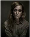
Photo: Erik Almås
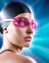
Photo: Steve Bonini
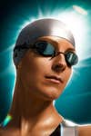
Photo: Steve Bonini
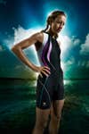
Photo: Steve Bonini
Photo: Cristiana Ceppas

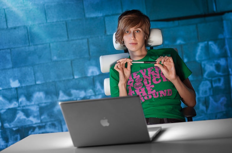
Photo: Lionel Deluy

Photo: Lionel Deluy

Photo: Lionel Deluy
Photo: Sita Mae Edwards

Photo: Randal Ford
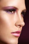
Photo: Natasha Lee
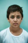
Photo: Cade Martin
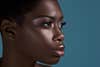
Photo: Naoe

Photo: Tim Tadder
Photo: Robyn Von Swank