Inkjet Printing Lessons from Joel Meyerowitz
For Joel Meyerowitz, inkjet printing offers a more faithful description of the world than C-prints or dye transfers.
© Joel Meyerowitz/Edwynn Houk Gallery
“The White Road,” reproduced directly from Meyerowitz’s C-print.
Joel Meyerowitz is one of photography’s consummate color printers. The C-prints from 8×10 negatives that he began making three decades ago were simply breathtaking — often odes to pure color. Meyerowitz is no fan, though, of the high-saturation output prized by many digital photographers. “A lot of photographers are seduced by the gaudy, contrasty options that digital printing offers so readily,” he says. “They like that juiced-up quality. But I’m trying for the kind of subtlety that the negative is filled with. That’s why I use an 8×10 view camera, so I can see everything that’s out there, in all of its renditions and gradations.”
Meyerowitz, who taught himself Photoshop when it was just three versions old, has experimented with many inkjet printers to see if they can deliver the depth and tonal delicacy he prefers. None satisfied him until the arrival of the HP Designjet 130, an affordable dye-based model that produces 24-inch-wide prints with HP’s Vivera six-color inkset. Meyerowitz now uses this printer and its 13-inch, nine-ink cousin, the HP Photosmart 8750, for nearly all of his printing projects. These include a major show of his work from the transitional 1970s at the Jeu de Paume Museum in Paris, to open this October; photographs of the World Trade Center site made in the year after the disaster, to be published in a Phaidon book on its fifth anniversary; and 52 Mondays, a year-long series of quotidian images from Meyerowitz’s hometown, New York, all shot with the Olympus E-1 digital SLR. Here Meyerowitz describes the epiphany that led to his digital conversion, and the details of how the Designjet 130’s quality has allowed him to retrieve detail from old chromes and negatives that he had simply given up trying to print conventionally.
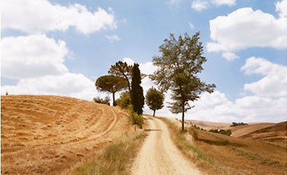
© Joel Meyerowitz/Edwynn Houk Gallery
“The White Road,” reproduced directly from Meyerowitz’s HP Designjet 130 inkjet print.
For most of my printing life I accepted that there was no alternative to what chemicals could do. I always thought the best match to a color negative was a C-print, or, when I could afford it, a dye-transfer print. The image that changed my mind is one I took in Tuscany, of a bleached-out dirt road receding into a clump of trees with cut fields on either side.
I had tried every inkjet printer that was supposed to be any good, and always found them wanting in one way or another. Though I used them to make prints for laying out book dummies or exhibitions, I never could sell their output as fine-art prints. The dealers wouldn’t take it and most of the art world wouldn’t accept it. “Inkjet prints?” they’d say. “I’ve got an inkjet printer too.”
A few years ago, right after I’d finished my book on Tuscany, Inside the Light, an HP Designjet 130 printer came into the studio for us to test. The book’s master prints had just come back from the press, so we decided to scan one of the Tuscany negatives and make a print on the HP for comparison. We didn’t do anything special in terms of manipulating the image. I said, Let’s not go crazy, let’s just see what this printer does.
“The secret to my success with the Designjet 130 is HP Premium Plus Satin inkjet printing paper. It’s an extraordinary invention. The paper has six layers, and the top layer incorporates some kind of nanotechnology that causes it to open up when a hot, wet droplet of ink hits it. The paper swallows the dye into a layer below the surface; that layer is shielded from the layer beneath it by a buffer. Beneath the buffer is a brilliant white layer that reflects light back through the ink. After the ink hits the paper’s top layer, it seals up so that it’s impermeable to atmospheric elements.
Pemium Plus Satin really looks like a traditional photographic paper in its surface properties. Among other things, it defeats bronzing, which for me has been the death knell of inkjet papers.”
The digital print came out and I took it to our viewing station along with the C-print I’d made for the book — a print that probably took me eight or nine tries to get right in the darkroom. And when I looked at the two prints side by side, I realized, something’s happened here. On the day I took the picture, I wrote in my log that the field on the right side of the road was freshly cut — I could smell it — and the field on the left, being much yellower, had probably been cut a week or two before. Yet in the C-print, the right-hand field is swallowed in a kind of gold that’s homogenous with the gold on the other side of the road. There wasn’t the differentiation that I’d originally observed.
Throughout the print, in fact, the greens were being smothered by yellow. And even though the trees in the center of the scene were different — a cypress, a pignoli, some other young tree — they all had the same khaki green color in the C-print. Then I looked at the print from the Designjet 130, and each of those trees had individuality. The pignoli had its red needles and bows up underneath the green of the tree, the cypress had its own hue, and the young tree had the different green of its new leaves. There was also a visible difference between the golden field on the left side of the road and the freshly-cut field on the right; in the freshly cut field, green was mixed in with the gold. I started to see that the digital print gave me a gamut much closer to what’s inherent in the negative.
Anyone who has spent time in the darkroom knows the struggles and the tradeoffs of traditional printing. I think that contemporary digital printing, together with Photoshop, gives you the opportunity to recast certain pictures that were at best a compromise — prints where you had just a few seconds to move your hands in the light and, hopefully, open up some little corner that you were worried might go too dark. But there was never enough time.
This image of a lighted doorway on Cape Cod was one of those 8×10 negatives that I could never get a good print from. It had inherent flaws because of the long exposure and the fact that the light was coming at the camera. During the exposure the light had leached into dark areas of the scene, and I just couldn’t burn and dodge in a way that was authoritative. To get rid of the halation I had to hold back the interior of the doorway while I burned in around it. It was always just a mess, too light here, too dark there. I basically gave up on that negative years ago, and yet I knew that from my memory that it could be an interesting image.
With digital I was finally able to master the negative. I used Photoshop to mask out the doorway in just the right way so that I didn’t compromise the quality of the light inside it or the light over the sea. I was able to bring the picture back into the kind of light proportions I’d originally observed. In fact there was a streetlamp behind me when I took the picture, and it added a cool-to-greenish tinge to the scene that I could never reproduce in the C-print. Photoshop and the HP print let me recapture the kind of discrete color that I originally responded to.
“Whenever I would see that pool of bronzing in the blacks of other inkjet papers, I would think, Ugh, this isn’t a photograph. I want to have the purity and depth that you get with real photographic paper, so it doesn’t look like art paper, a painting, a lithograph, or anything other than a photographic print.
In its range and authority, Premium Plus Satin comes closer to the quality of real photographic paper than anything else I’ve experienced. It exceeds my expectations. I’ve even been using it to make match prints for a book I’m working on, so that the print house has a reliable reference for the reproductions. And I now use the paper to make prints that galleries sell and museums collect.
Technology, whether it’s in a digital camera, an inkjet printer, or a paper like this one, is the engine that drives photography. It’s what keeps the language rich.”
Dye transfer was always the gold standard of traditional color printing. I went back to a 35mm Kodachrome from 1967 to see if I could make an inkjet print on the Designjet 130 that was as good as the original dye. What I saw was that I could make the inkjet print better than the dye transfer. Because the dye was made from three black-and-white color separations, it didn’t handle certain transitions well. In some of the corners of the dye-transfer print, where the light falls off, instead of going to a gray or a black the tone went slightly green. The dyes simply couldn’t hold the transition.
With the Vivera inks on the HP printer I was able to maintain the kind of gradation that goes into shadow without it slipping into color. I was even able to get the darks in the painting to yield a little bit more. I felt that the digital print matched the feeling of the dye transfer, but actually exceeded it in the transitions down into the darkest tones.
I’ve been using the Designjet 130 to print my early Kodachromes that were originally produced in limited editions of three or four simply because the dye-transfer process was so expensive. The digital prints are cleaner. Even the grain is less visible. The dye transfers picked up a certain granularity from the black-and-white separations, and always buzzed a bit. The prints from the Designjet 130 do a better job of reproducing the creaminess and wonderful, long tonal scale of Kodachrome. I think the prints are actually more beautiful.
For me, digital printing has brought back the joy of the darkroom without the drudgery of standing over the chemistry. I really feel that it has rejuvenated me as a photographer. I love the darkroom, but in recent years it has been so hard to support my-self and also spend enough time in the darkroom. Being able to sit down at the computer in odd moments and make digital prints lets me be productive again as a photographic printmaker. — As told to Russell Hart