How To Crop For Better Composition
Change the focus -- and boost the impact -- of your picture with a scene-shifting crop.
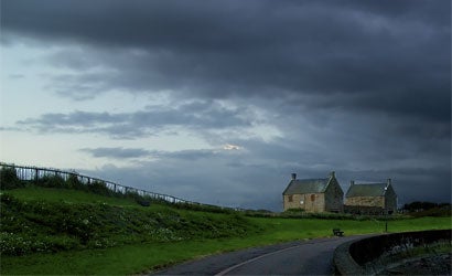
Decisions, DecisionsHuriye Akinci, Ankara, Turkey
The Problem: A very dramatic vista in Prestwick, Scotland, captured at a peak of menacing weather, gave us an opportunity to trundle out the Rule of Thirds and try a variety of alternative compositions. First, let’s look at the original: While the progressively darkening tones and the sweep of the stone wall create some dynamism, putting the house plunk in the center of the frame keeps the composition on the static side. Notice, too, that the stone wall intersects the picture edge right in the center, which doesn’t help. We also had some concerns with the color enhancements (a bit over the top, perhaps), but this was an aesthetic decision by the photographer to emphasize the wildness of the scene, and it’s effective.
What now? Cropping the picture, we realized there were many framing possibilities. We liked these three: 1) With the house in the top right corner, the wall and the fence funnel in toward the house and out of the frame, and exit in the top third. 2) Placing the house at the bottom right corner emphasizes the sky, while the fence and the line of clouds make a gentle S-curve across the frame from the upper third to the lower third. 3) Having the house in the top left corner puts the accent on the wall, forming a dramatic curve that leads the eye in toward the house, then out to the darkening sea and sky — again, with the exit point one-third down the frame.
Next time: Hey, image-editing programs make cropping easy and fun. When you take a picture you like, see how many other pictures you can make from it. Place important elements anywhere but dead center, and various dynamic compositions can fall into place. Tech info: Nikon D70s, 17-70mm f/2.8-4.5 Sigma lens. Two exposures, f/5.6 at 1/30 sec and 1/125 sec, respectively, were combined for a high dynamic range effect in Adobe Photoshop CS2. Colors boosted in Nikon Capture NX.
|||
|—|—|
| Before| After 1|
|
| After 2| After 3|
|
Cleaner cropDrew Wilson, Sarasota, FL
The Problem: An interesting shot of vernacular highwayside architecture, and we like the streaks of the headlights, which make for a quirky sense of motion. But while empty space isn’t necessarily a bad thing, the big expanses at the top and the bottom don’t really add anything to the picture. We also thought we could go for a little more color here and there — for instance, in the tree in the background.
What now? We cropped the picture to square format, which better suits the photographic space. We used Curves in Adobe Photoshop CS2 to brighten midtone areas and boost contrast. Also, we nudged the color a little bit warmer, figuring that we weren’t going to get terribly accurate color in the background tree anyway, so we might as well go with atmosphere.
Next time: Squares aren’t just for medium-format shooters. We’ve noticed lately that many readers who take rectangular photos don’t see the square pictures inside them. Try different framings to see what best suits the subject. And try different shapes: The square format can be cool, all those wide-screen monitors notwithstanding.
Tech info: Nikon D50, 28-80mm f/3.3-5.6G Nikkor, 3 sec at f/4.5, ISO 400.
| Before | After |