The Fine Art Printing Process
Digital imaging has spawned more how-to books than film photography ever did, making it harder than ever to separate the...
Digital imaging has spawned more how-to books than film photography ever did, making it harder than ever to separate the instructional wheat from the chaff. We’ve found that the best of these books are often a joint effort, with two photographers filling in the gaps in each other’s experience and knowledge. Perfect Digital Photography: Expert Advice for Capturing, Correcting, and Printing Exceptional Images (McGraw-Hill, $40) is just such a book. Co-authored by Pulitzer Prize-winning National Geographic photographer Jay Dickman, a member of both the Olympus Visionary and Lexar Elite groups and director of the popular First Light Workshops program (www.firstlightworkshops.com), and photographer Jay Kinghorn, an Adobe Photoshop Certified Expert and noted fine-art printmaker, it is a full-service tutorial that never puts technical over aesthetic considerations. The following excerpt is one of the book’s 17 self-contained “How To” lessons, which alone are worth the price of admission.
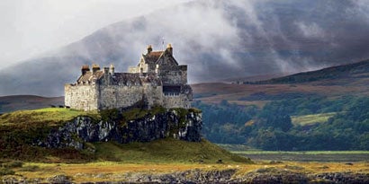
I love the art of printmaking. While I enjoy the process of sculpting and shaping a digital image, I get the most satisfaction from seeing the finished print. For me, it is the best means of sharing and enjoying the fruits of my labor. I wanted to give you some insight into how I prepare an image for printing. Duart Castle sits on the southwest coast of the Isle of Mull in the Hebridean Islands of western Scotland. For several days the weather had been classically Scottish, with gales blowing sheets of rain off the Atlantic, but for a brief window, the rain stopped and the clouds lifted. Sunlight splashed across the verdant hillsides, and I took this picture of a landscape that, to me, exemplifies Scotland.
Step 1
To prepare the image for printing, I open the RAW file through Adobe Camera Raw and adjust exposure, contrast, and white balance (far right). Before opening the image in Photoshop I set my crop to a 2:1 ratio for a finished 20-inch by 10-inch print and choose to export the image at 16 bits-per-channel, since I know I will need to upsample the image in Photoshop to reach my desired print size.
Step 2
My first step in Photoshop is to bring the image up to its finished print size. I do this through three passes of Bicubic
Step 3
Next, I perform my image corrections on separate adjustment layers. I want to make the sunshine (a rare thing in Scotland in the fall!) more prominent and darken the clouds behind the castle to make the castle appear brighter. The image on the top (at right) is the original file without corrections. The image on the bottom, along with the Layers palette, shows the corrections I’ve made. At this point, I will save this layered file as my master image. This file can be reused to print on different media or can be flattened, resized, and used on the Internet. The rest of the changes I’ll make to the image are print-specific, so I don’t want to save them as part of my master file.
Step 4
I activate the Soft Proof tool (View | Soft Proof | Custom). I will be printing to Epson’s Enhanced Matte paper, so I choose a custom ICC profile I’ve created for that paper on my printer (top right). I click OK to leave the soft proof active.
Step 5
The soft proof shows me that the deep shadows on the cliff below the castle are going to lose detail (here). So I’ll bring them back into the printable range with a Levels Adjustment layer. I increase the shadow value of the Output levels (below) until the abrupt transition disappears from the face of the cliff.
Step 6
I want to increase the saturation of the greens in the image, but want to make sure that I don’t oversaturate colors beyond what the printer can print, so I turn on the Gamut Warning feature, which places a gray overlay on out-of-gamut colors. Next, I create a new Hue/Saturation Adjustment layer and add 10 points of saturation (right). This makes the grass more vibrant (bottom)
Step 7
I feel that the soft proof of the image looks a little flat. To add some contrast to the image to give some extra punch to the print, I create a new Curves Adjustment layer and add an S-curve to add contrast through the midtones (right). This accentuates the splash of sunlight on the west side of the castle and helps visually separate the castle from the background.
Step 8
Before sharpening, I turn off the Gamut Warning and Soft Proof. I’ll use the new Smart Sharpen feature, which does an amazing job of sharpening digital camera files. I set my full image to 50 percent zoom for an effective preview of the finished print, while using the Smart Sharpen preview window at 100 percent to assess critical detail (below). I find the Amount setting of 250 and the Radius of 0.8 to my liking in the Lens Blur mode with More Accurate checked.
Step 9
I’m now ready to print. I’ll check to make sure that I have the media type chosen in the print driver and that No Color Adjustment is checked.
After printing, I’ll let the print dry on a flat surface for 24 hours, then spray the print with Premier Art Print Shield Lacquer to protect the surface of the print from scratches and ultraviolet light.