The Color of Skin
Hollywood photographer and author Lee Varis explains how to control and enhance skin color in digitally produced photographs of people.
As photographers increasingly “go digital,” they face new challenges in controlling color in their images, and nowhere is this more apparent than with skin tones in portraits. Photo illustrator and educator Lee Varis, in fact, has put out an entire book about the subject: Skin: The Complete Guide to Digitally Lighting, Photographing, and Retouching Faces and Bodies (Sybex, $40, available through Wiley Publishing Inc.). “Though the focus of this book is on skin, the concepts and techniques apply in all types of photography,” Varis explains. “I’ve attempted to address the rather large holes found in other books on the subject of people photography.”
With chapters on subjects including lighting, tone and contrast, retouching, and special effects, this volume is crammed with practical tips for professional portraitists as well as serious enthusiasts. In the following excerpt and images from Varis’s new book, the author examines skin color in detail, including a technical foundation, basic color controls, and instructions for adjusting color.
— Jack Crager
White Points, Black Points, and Places In-Between
By far, the biggest problem that digital photographers face is getting the color right. If you’ve been photographing traditionally for any number of years, you’ve most likely learned how to expose images properly and you’ve assembled a collection of lighting tricks that have served you well. Before digital capture became practical though, you never really had to take much responsibility for your color rendering beyond choosing the right film emulsion for the color temperature of the light. If you shot negative film, you could leave everything up to the lab. Even if you shot transparencies, the lab was mostly responsible for delivering credible color based on what the film manufacturer created with a batch of film.
Nowadays, that’s not quite the case. Even if you have all your printing done at a lab, you still must assume at least part of the responsibility for the exact rendering of the color in the digital file. Most photographers approach this as a problem in color calibration or color management. This is consistent with a traditional film testing approach — you get a new batch of emulsion and you test it by taking photos through different colored CC filters: 025Y, 5M, 81A, etc. The idea is to find the particular bias of a certain emulsion and compensate for it. The concept behind digital color management is similar, although it’s a bit more complex. The problem is that, with film, the basic tonal/color rendering is fixed at manufacture. The photographer/lab has only minor influence on the color rendering. Digital, on the other hand, is much more malleable. Hue, saturation, and value rendering can be manipulated to extremes. This kind of control is scary for the traditional photographer because the safety valve of fixed rendering is no longer present. The color can be anything you want it to be … so what do you want it to be?
Many digital photographers attempt to replace that safety valve with a rigorous ColorSync color management system. By shooting targets of color patches and using software to build detailed color description tags for digital files, the idea is to create color that is accurate to the original scene. Debates about exactly how to do this are ongoing; there are many methods for creating accurate color. For some commercial photographers, this “accurate color” may be all they need because all creative color decisions will be made later on in the post-production phase of a project.
Unfortunately, accurate color is often boring color. For many people, as professional photographer Jeff Schewe likes to say, “Reality sucks.” We are conditioned to expect an idealized Hollywood version of color in photos. This is not necessarily super-saturated Kodachrome-Velvia color, but usually it is a departure from strict accuracy.
The primary tool for color and tone manipulation in Photoshop is the Curves dialog. You open the Curves dialog either by choosing Image > Adjustments > Curves or by making a new Curves adjustment layer. Using an adjustment layer is the better method: Click the Adjustment Layer icon at the bottom of the Layers palette and select Curves from the resulting menu.
The first time you enter the Curves dialog, you’ll see the standard, straight diagonal line graph. This is an xy plot of input to output values — input values plot along the bottom and output values plot along the left edge. The diagonal line represents the relationship between input and output. This perfect diagonal means that there is no change (that is, x equals y), and output values are the same as input values. The gradient along the bottom and the left edge indicates the progression of values from light to dark as they are mapped to the line.
Sometimes the gradient is set up to represent ink densities so that as it progresses from left to right, it gets darker — adding density. Photographers working with additive color, as with RGB, usually prefer to think in terms of adding light so you can reverse the gradient by clicking anywhere inside the gradient.
You can use a finer grid by Option/Alt+clicking the grid to toggle between fine and coarse views. The input and output values for any point that the cursor is over will be shown below the curve.
The Channel drop-down at the top of the dialog allows you to affect all channels or individual channels depending on what is selected. We will confine ourselves here to examining the contrast and tonal effects of the curve so we will only look at the composite (RGB) channel.
Contrast Control: The Basic Curve Shapes
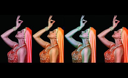
In several of the photographic figures accompanying this article, different curves are applied to a black-and-white image, and a 10-step Zone scale is placed at the bottom of the curve dialog in each to help you visualize the different effects of various curve shapes. (Click the image at top to scroll through the slide show and see the different effects of different curve settings.)
Keep Saturation in Mind
So far we’ve been looking at monochrome images because we’ve been concentrating on tone and contrast. When we start including color, we have to be careful with contrast-enhancing curves because they almost always increase saturation as well. If you need to increase contrast without increasing saturation, you can use RGB curves in an adjustment layer and change the Layer Apply mode to Luminosity.
In reality, there is no ideal skin tone — skin color is all over the place. There is considerable variation in different ethnicities, ages, and skin conditions — not to mention makeup! While all this variation exists in the real world, we tend to tolerate much less variety in print for various reasons. One reason is cultural norms, and this can get you into trouble if you’re not aware of it.
This is illustrated by the following anecdote, which actually happened to me, and by the final two images in the accompanying slideshow.
The story concerns a job I did in this country for the Belly Dance Twins, Neena and Veena. I did some promotional photography for these two gorgeous Indian dancers — several of the shots were taken with traditional Indian costumes that were quite colorful.
The Twins were not happy; they thought the skin tone was too dark. To me it looked authentically Indian, which I thought was the whole point. I was not aware of the cultural issue here: dark skin is associated with the lower caste — pale skin color is more desirable. (In Hindu religious iconography, the color of the various female Devas is almost always very pale, in some cases blue-white.) Everything I did for them had to be revised with a lighter color.
In conclusion, getting the right skin color is far from trivial. Simply calibrating your capture system is not going to guarantee that you will get an ideal skin tone. You have to be prepared to edit the color to satisfy the cultural, personal, or psychological needs of your clients or yourself. There are many creative departures possible as well. You need to develop the color “chops” necessary to get the color you want consistently, and a thorough grounding in Photoshop color editing is an absolute must.
Remember that the color of skin that is acceptable in reproduction is most often a departure from reality. The numbers supplied here are good guidelines, but they are only guidelines. Don’t forget that you might need to deviate from these values.