Color and Contrast Tweaks to Make Your Tones Pop
Smiling pooch Tim Cameron, Chilliwack, BC, Canada The Problem: Once again, we commend a reader for smart use of black-and-white...
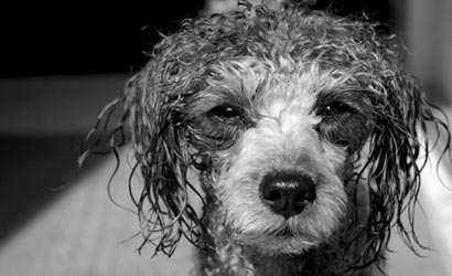
Smiling pooch
Tim Cameron, Chilliwack, BC, Canada
The Problem: Once again, we commend a reader for smart use of black-and-white — this portrait of a happy silver-haired poodle (Finnegan by name) works perfectly in monochrome. And also once again, we have to comment on a b&w conversion that’s, um, challenged. The contrast is a little too hot, resulting in highlights (on the nose and fur) blown out, and shadows (in the eyes) lost. There are also a few too many bright distractions around the face.
What now? We reconverted from the original color file (using Adobe Photoshop CS2’s Channel Mixer) to get a fuller tonal range in the file. This in turn let us get back some highlight and shadow detail. We cropped a little to get rid of distracting light to the right of the pooch’s head and at the top of the frame, but kept the bright triangular background shape because we thought it makes for a nice compositional pointer (excuse the pun) to the subject.
Next time: Don’t just desaturate, or click on Grayscale, if you want to make a digital black-and-white conversion from a color original. Many image-editing programs (including Photoshop, as well as Photoshop Elements) provide additional controls for monochrome conversion, and there are some plug-ins for image editors that let you explore various “film looks.”
Tech info: Pentax *ist DL with 18-55mm f/3.5-5.6 Pentax DA lens, 1/350 sec at f/8, ISO 200. Grayscale conversion, contrast/brightness adjustments in Corel Photo House.
|||
|—|—|
| Before| After|
|
Turning Leaves
Rick Streff, Santa Clarita, CA
The Problem: This is essentially a study in color, with the artificial blue of the lawn chairs and the house trim contrasting with the natural oranges and reds of the autumn leaves. The composition isn’t great, but that isn’t really the point. Still, we think the image could be more focused into the house. And is that horizon really straight?
What now? We straightened the shot, and, rather than throwing the house off-center (the way we always seem to do), we exploited the centered composition completely by making the image into a square. (Somewhere, Hasselblad and Rolleiflex shooters are laughing.) We cropped enough to get rid of the street and peripheral clutter.
Next time: Move a little closer, zoom a little tighter, or both. Try another vantage point — there might be a better picture in this scene.
Tech info: Canon EOS 5D with 24-70mm f/2.8L Canon EF lens, 1/50 sec at f/3.5, ISO 100.
|||
|—|—|
| Before| After|
|
Falling Water
Charles P. Allen, Arlington, VA
The Problem: An example of how good intentions can be punished, this image is an HDR — a high-dynamic range photo that combines multiple images to attain maximum range in shadows to highlights. And that’s the problem: It’s a nicely composed image that has no snap.
What now? It’s always easier to add contrast, which is exactly what we did. We used Curves in Photoshop to darken shadows, edge up the highlights, and intensify the colors. While we were at it, we cropped the foreground rock because we felt it loomed a little too large and distracting.
Next time: HDR imaging is a great tool, but not every subject benefits from the treatment. We think this image would have worked out fine shot in RAW, particularly since it was made under an overcast sky, which softens scene contrast.
Tech info: Nikon D200 with 18-35mm f/2.8 Zoom-Nikkor lens, five exposures taken at f/22 at 1-EV shutter-speed intervals, ISO 100. Converted to HDR image in Photoshop CS2.
| Before | After |