How-To: Present Your Photography Work In a Printed Portfoloio
Even amazing images can be ruined with bad presentation

In my column for American Photo on Campus last year (reposted at PopPhoto.com/campus), I focused on how you think about making imagery and how that thinking informs the way you present your photos to the world. This year I’ll explore the details of displaying your photographs in various pre- sentation or promotional avenues, beginning with the most analog, your printed portfolio. After all, in school you’re probably printing and will eventually present an iteration of your book for feed- back (or a grade) at the end of the term. And if you ever attend a big portfolio review, you’ll need one. Of course, in classes or your own research, you will gather lots of information on making a port- folio. Some photo programs dic- tate how you must present your images—right down to the width of the white border around your prints. So while the three rules here are sacrosanct, my other tips can be adapted to your needs.
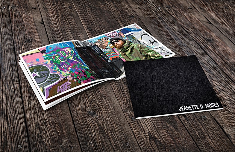
PUT YOUR NAME ON THE COVER
No exceptions! Emboss it on the leather at the high end of expense; include it as the title of a bound book from a self-publishing service; make it visible through a Lucite cover; or just write it on a beautiful sticker that won’t fall off. Even at this early stage, it’s critical to establish “visual equity,” always showing your name with your images. This is the beginning of the branding that will continue throughout your life as a photographer and it must start with your very first book. It also creates a psychologi- cal commitment: Own it!
KEEP IT PRISTINE
Your portfolio doesn’t have to be black, but it does have to be clean. It also must be durable and big enough to make an impact (no smaller than 11×14 inches), but small enough to open comfort- ably on a viewer’s desk or lap. Most potential commercial clients see a red flag when your portfolio is overdesigned, with cowhide or fringe or corrugated cardboard on the outside. They think the photos inside will be underwhelming— and they’re usually right. Also, if your book has a metal spine or cover, file down the edges; they tear clothing (especially tights).
PICK A FORMAT AND MAKE YOUR IMAGES STICK TO IT
Vertical, landscape, whatever—no one wants to be turning your book in every direction while leafing. through it. For example, if you have a horizontal image in a vertical book, either print it going across the gutter (no, this won’t kill it) or show it on one page with borders on all four sides.
Most viewers, and even photog- raphers, would rather see photos without plastic or acetate sleeves, but to me it is more important to keep the work fresh. Are you really going to update a custom- printed book frequently with images on both sides of a sheet of paper? If you can’t commit to that, don’t choose this format.
If you do use sleeves, make sure they are neither reflective nor scratched, and get rid of the black paper that comes with them.
If you want a traditional ”fine- art” presentation of prints in a box, it is OK, but a book may be better. Even when it’s meant for gallerists, it is important to control the order in which they see your images—impossible with loose prints. A box is also a huge pain at a big in-person portfolio review, when you meet with many people back to back. With a box, the rule still applies: Put your name on it. Portfolios usually need protection against dings or bent corners. A slipcase or bag with handles will suffice. It can be pretty and, again, doesn’t have to be black. But don’t put the book in a slipcase and the slipcase in a bag. Oh, and have I mentioned this yet? The bag. Your name goes on it, too.
These tips should help you start shopping for a new portfolio. Next time, we’ll get to the inside: printing formats, sequencing, typography, and, assuming the pictures are fabulous, what else to include for a strong and memorable impression.