Interview: Playboy Photo Director, Rebecca Black on the Magazine’s New Retro Aesthetic
Playboy has undergone a massive shift in content and look
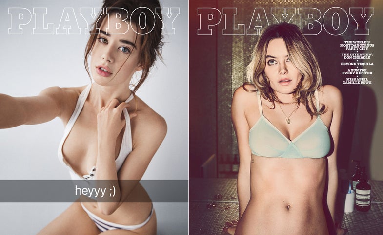

Last year, it was national news that venerable men’s lifestyle magazine Playboy was doing away with full-on nudity in their pages. But, the banishment of the nipple was just a part of the magazine’s complete overhaul. Picking up a copy now, the photography feels immediately different. Even the most recent cover embraces a warm, retro look that’s so very “in” right now. If it looks like film, that’s because it is. In fact, Playboy is shooting a lot of analog these days. I sat down with photo director Rebecca Black to talk about what it takes to redefine the Playboy look.
How did you first get started with Playboy? Was a shakeup in the overall aesthetic part of your aspirations coming into the job?
I’ve been with Playboy going on four years now. I originally came in because they were looking to make a change and they thought things needed to be shaken up visually and made slightly more current. I got a call from the editor at the time when some people were leaving after having worked here for 20 or 30 years. I had some big shoes to fill. These people had worked with all of the greats at Playboy and had experienced many eras and evolutions of the magazine.
The magazine looks drastically different now than it once did. Have they tried to make changes like this before now?
Absolutely. You can see visual timeline. We had these little bursts of change, but we always sort of reeled it back in. We have a subscriber base that’s really important to us and we didn’t want to lose them, so there was a careful balance of maintaining people who have been really dedicated subscribers for so long, but also changing things to make sure that we’re still evolving and on the cutting edge that Hef originally expected us to be on journalistically.

So, you didn’t think the aesthetic matched the overall tone of the rest of the content in the magazine?
We were covering stories that are just so “right now” and announcing all these issues in the world. We had all this interesting subject matter and celebrities. We had to do the same with the visuals and make sure they’re relevant to the current day.
It seems like a lot of people associate that highly-polished photography style from the late ‘80s and ‘90s as Playboy’s signature style. Was that look embedded as deeply as it seemed with the readers?
Yeah, shoots with a million cards everywhere [laughs]. It’s amazing because it really is a sticking point in everyone’s mind. Over the past three or four years, though, I think we have evolved and changed. It may have gone unnoticed because I think for some people in the younger generation, they had this idea that it was just this one way with all these gels and lights. It was all very polished.
Was it cathartic to have the redesign as an opportunity to make really significant changes?
100 percent, it was such a liberation. We could basically throw everything away visually. We had a group of people who were shooting for us on contract, which gave us consistent photography, but also gave us photography that was quite similar. We got to erase the board and start from scratch and really think about what the core elements of Playboy are. At the beginning it was so popular because it was so cutting edge. It showed people how they could live and brought them into a world. If we’re going to try and bring people into a world today, that means scrapping everything that had to do with that ‘90s look. It brings people more of a reliability. It’s a more realistic approach.
Does that affect the idea of fantasy that is, for better or worse, often associated with the magazine?
People don’t want the same fantasy created for them. The fantasy today is reality and you can see it everywhere. Whether it’s reality shows or influencers on social media, people want a view into someone’s life. That doesn’t mean that their skin is perfectly retouched and their outfit is meticulous, but it’s about capturing spontaneous moments that allow you to feel like you were really there.
Have you been monitoring the public reactions to the new look?
For sure. It’s interesting because it’s all tempered by the fact that I think our mission is never quite accomplished. I’ve heard so many positive things like when I go on set or bump into people. Being in a bubble, it’s hard to hear things sometimes, but you step out of it and people realize that it’s changing. The proof for me is that these artists who are at the top of their game right now are calling us to see if they can work with us. That suggests to me that we’ve struck upon something here that’s relevant and more a part of the time that’s happening now.
Have you gotten any blowback from people upset about the changes?
Once in awhile we get a funny letter (laughs) on some strange stationary that has come from someone who might be disappointed that there’s not nudity anymore. But, the real goal of Playboy is—if we’re going to write incredible articles and shoot gorgeous pictures, they deserve a platform to be seen. In the modern media world, you need to be safe for work. You have to be in front of the newsstand. Where else are people going to have access to you? Eliminating the nudity became an obvious step for keeping our message out there and have people see what we’re about. We wanted that wider audience.

A lot of the shoots for the magazine now are being done with film rather than digital cameras. What’s the motivation there?
Obviously there’s a movement happening in the world of photography. I feel like almost every photographer I know is going back to film. There’s a feeling that everything is currently out in the ether. To have something truly tangible that you can’t fix and manipulate right away—that wait—is exciting. There are happy accidents you get with film. You can’t just erase a photo. There’s not a monitor sitting there at the shoot with 10 people standing around it pointing and looking. It’s more of a creative flow. I think that it translates into the final product. You actually see just the amount of attention that goes into it because you really only get one shot. There’s also the idea of how beautiful and warm it feels. Everybody really loves the retro feel of that graininess.
Part of the redesign also included fancy new paper. That’s not something happening often at the moment as budgets are getting cut.
We love the new paper. It’s so nice to see photography on that paper. We want to show a level of quality. If we’re going through all this trouble to really do it right, we needed to have the right paper to put it on. To us, it makes all the difference. It creates—and this might sound silly—an entire vibe while you’re reading it.
Are there particular eras of photography in Playboy’s history to which you’re drawn?
For me, the older the better. How could you not love Helmut Newton? I just love the stuff from the ’60s and ‘70s. Some of the ‘80s stuff is really fun, too. What I’m also noticing is that a lot of the newer photographers that we’re talking with about ideas and concepts is that everyone seems to be totally into the ‘90s now. It’s really kind of funny. Everything comes back.

Has the changing photographic aesthetic influenced the types of models that ultimately end up in the photographs?
Absolutely. There was a time–and it seems to be the time that everyone remembers most–where all the women were enhanced. Basically the woman that we’re looking for now isn’t just someone to look at, she’s part of the narrative. The April issue has photos from Nate Walton and Molly Steele and they’re friends. She’s an amazing landscape and nature photographer. They did this as a project together. Molly actually became a part of the narrative of the story, she wasn’t just a muse to look at. Most of the women that we’re looking at now, the cup size doesn’t matter as much. It’s about someone being really proud of how they look and the things they’re doing in their life.
Is the idea to stick with this current retro aesthetic and establish a new signature Playboy look, or to evolve as the photography world moves along?
I think we’re constantly evolving and I think we should be. We’re not going to be jumping on every whim. We want to be leaders instead of simply following something, but we definitely pay attention to our surroundings and what’s happening. All art is based on what inspires you and how could you not be inspired by what’s going on around you? People could adore this raw feeling for a couple years and then it might become fresh again to go to a more produced place.
For now, with reality being king, people just want something real. They don’t want a crazy elaborate fantasy that they have to step into. They want to feel like a voyeur in the real world.

How have the photographers reacted to the change?
There are many more people in the game now. I had a meeting a few months ago with a really big agent in New York who represents people who—back in the day— could call all of the shots. They were pitching him hard to me. I had to tell him that it wasn’t exactly the look we’re going for. It was very polished and very celebrity. The agent started saying things like, “[the photographer] just bought a house out in the country and they have been living out there for a while. They’re really taking it back to a really organic and raw place.” If you were to look at the person’s portfolio, you would never think that in a million years. You get the sense that everyone really just wants to stay in the game and keep doing their craft. But, the playing field has shifted.
As a photo director, what do you look for in a photographer for the magazine?
Being able to capture the spontaneity of a moment and have it feel super authentic is something a lot of people try but it doesn’t always translate. I wish I could bottle that. It’s just something you see and then you know that there’s something special there.
With so many more media channels outside the magazine itself, has that changed the way you operate in terms of creating photography for the brand?
There are always outtakes that I’m sad we didn’t get to run. The web is another opportunity for me to pull a few and share them on social. Those photos have a life now if they didn’t fit the pages. We always shoot so much that it’s nice to pick additional selects. Sometimes you’ll do a setup and maybe it doesn’t completely feel like it fits in one story, so you can create a whole different story. There are some benefits to it. We’re always shooting video on set. Everything is multimedia. It’s the way it is.
