Capturing Cultural Dualities in Modern Day Turkey
A new book with a clever layout helps communicate the complexities of this country
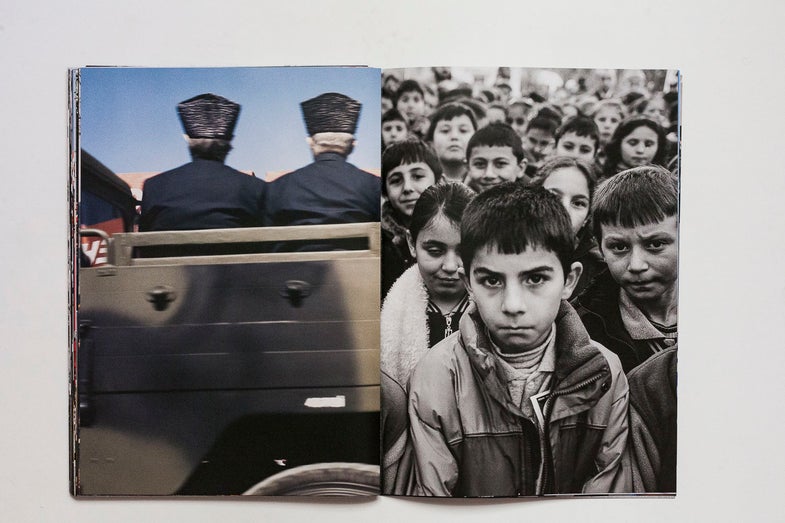
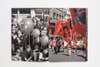
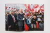
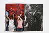
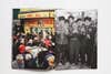
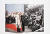
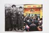
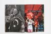
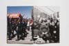
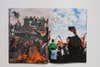
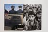
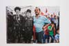
A strong series of photographs is an ongoing visual dialogue. Each photo speaks to the one before it and the one after it. Different sequences of the same set of photographs can have different effects on the viewer. In Turkish photographer Korhan Karaoysal‘s book Reason Purpose (Neden Amaç in Turkish), horizontal photographs are split in two. The left side of the page has half of one photograph and the right side has half of another, turning the book into a kind of visual puzzle. The book is also a mix of black-and-white and color images, and when the halves are paired with each other, they create new images.
Shot between 2007 and 2015 , during a time of great change in Turkey, the images capture group gatherings that highlight various aspects of Turkish society, culture and history; and the friction between the old and new. It’s an account of Turkey’s recent history designed in such a way that it keeps you engaged.
Karaoysal spoke with American Photo about the importance of a good editor, switching between black-and-white and color and how street and documentary photography can work together.
How did this get started?
Well, I was always thinking about ideas as a documentary photographer. What should I work on next? What should I shoot next? This was always my concern. Before that project, I was photographing my family, a visual diary like many other documentary photographers did several times. But I am always into sociology as a kind of hobby. My family work was also into sociology in that sense. It wasn’t just like a visual diary. I was seeing it as a representation of a middle class family living in a suburb.
My family’s story was somehow related to our city’s history because I was born and raised in the center of Istanbul, in the Fatih district, and when I was four years old, we had to move to one of the first suburbs of Istanbul, which is around Bakırköy. When I was in high school, we had to move out again farther away. My family represents the situation of a middle-class family in a socio-economical context, but the photographs, I’m not sure if they were so much representations of the idea because people were seeing them as a personal visual diary. I started thinking, how can I connect this to another story to put into such a perspective, to give it a borderline in the social context of Turkey?
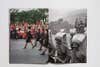
I was also interested in how people are coming together. I was also thinking and reading on crowd psychology. People are coming together. Why do they need to come together? For the last 10 years, I wasn’t a very social guy, but I was really curious what makes people to come together with other people. I made a schedule of all the events that’s going to take place in the next year. Some of those events are repeating every year like national days, religious days. I started going out and photographing those, but they were not only political events. Some of them are national days, some of them are little municipality events. For me they were all representative events. They were representing people’s ideas and feelings, and in such events, people were full of emotions. So it came to my mind as such an idea to go such places and take photographs. It was kind of similar to Robert Frank’s The Americans in terms of sense and feelings. It was one of my starting points to see my society and Turkish culture.
I can definitely see the influence of The Americans, but I think what sets this work apart is that you’re very much a part of the culture you’re photographing, right? With Reason Purpose, there’s a closeness that just comes by virtue of being Turkish.
That makes things easier. I can see their feelings. I know what they’re going to do next. I know why they’re there, what they are feeling, but I don’t really feel connected to any of those groups.
It’s rare that black-and-white and color work well together in the same thing. Usually, something is all black-and-white or it’s all color, but the book has a fascinating design that works really well and juxtaposes the two. As you were shooting, how did you decide between black-and-white and color for any given event?
Honestly, I didn’t. I just grab whatever I have at the moment, but I always knew that I have black-and-white in my camera or I have color in my camera. I really have a different approach and way of thinking of them. They are different in terms of feelings, so I always knew the difference. It’s a long-term work. It was like 10 years. I was always using black-and-white and color at the same time. That’s why I couldn’t put together all this work for a long while in an exhibition or on my website or in a book form.
For me, street photography in Istanbul should be in black-and-white because it’s a darker city with too much dust. I always saw Istanbul in black-and-white. If I am going outside and shooting in daily routine, I prefer black-and-white, but some events were very colorful—the flags, all the other things there. So I thought there should be color as well, but it wasn’t a very clear decision beforehand that I should go that way or this way. It was really difficult to put them together. I just took a rangefinder camera, and just took the film that I wanted with me. If it is a political rally, I knew that there would be colorful flags, Turkish flags or party flags in orange and red. So I took color film with me. When I’m going to other places, like small municipalities out of city center, I know there won’t be something colorful. There will be old veterans in old clothes. I want to do this in black-and-white. It depends on the gathering.
What about the design? How was that conceived?
In terms of the design, this book came out in a workshop called Book Lab. Okay Karadayilar and Frederic Lezmi invited me there to make a book dummy with other artists and photographers. They have been doing this for three years. Okay proposed to do it this way using horizontal photographs and dividing them into two verticals, and I was a very conservative photographer in terms of my work and using them like this. But then I suddenly remembered David Alan Harvey’s book about Rio. You know, he has a very good design, using horizontal photographs and dividing them into two pages. I thought it was going to work great with this book. It also reminded me of Boris Mikhailov’s Tea Coffee Cappuccino. He’s also using two horizontals and combining them together in a very nice way, but in both of those books, they are using the diagonals and the shapes. My photographs are mostly working in terms of content.
It seems to me that Turkey is living several layers of history at once. In the book, it’s like two different eras of Turkey’s history communicating with each other, but it’s just from the last ten years.
That’s true. You are totally correct. I totally agree with you. There are these historical layers, but it’s something else. We are between East and West. We are between positivist ideas from West and religious ideas from East, but it’s always a clash in between those two. I think this is where it’s all coming from. It’s causing a struggle for individuals as well. It never ends. You always have this struggle in between yourself, thinking about the ideas you’re raised with, with the education you get. There’s always a clash between those two.
What are some of the things you learned in the process of working on this, both in photographing and then making the book?
I think it taught me the importance of working together with a good editor. We started looking at photographs and we edited it in an order. Then Frederic Lezmi came and looked at them and made another order. It was his brilliant idea to match most of them. I can’t thank him enough for this.
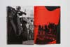
Also the importance of working with a good designer. Okay Karadayilar came here at that point, and he choose to make the design like this. It was his idea to use a red, translucent cover like this. It also resembles the color of the Turkish flag. For me, it works as the red filter we use in darkroom for black and white photographs. When you put a red filter on a color photograph, it suddenly becomes a contrasted black-and-white image. When you look at the first photograph from the color cover, you can think it’s a black-and-white image. It also fits well with the idea of using black-and-white and color. I learned the importance of a good editor and designer, but also the importance of a group of people. There were all the other artists as well. We also had each other’s work. We gave our ideas. We criticized each other’s work and books.
And for the first part of your question, I was already working on the streets as a documentary and street photographer with a rangefinder camera. I was practicing on this approach for a long while, but I learned doing this in a context, building a framework for myself, not just wandering around the streets as a street photographer, but thinking in the borderline of an idea, choosing my subjects, my topics like a documentary photographer, but behaving like a street photographer. I also came closer to opposing ideas, which I wouldn’t normally. I started understanding them somehow. After Gezi, after the coup attempt, everything suddenly changed in Turkey. The meanings behind these photographs, all these representations have been suddenly changed. They became huge. It’s out of control now.
When did you know you were at the end of the project?
I felt at the end when I was outside in Gezi protests. There are no photographs from Gezi protests in this book. I took some photographs in Gezi protests for two days, but never used any of them.
Why?
At all the other events I had distance. I wasn’t one of the people there. But in the Gezi protests, all of us found ourselves inside the crowds, even though we all have different or opposing ideas, everybody was protesting the same thing. Our generation, people a bit younger than me, are always being blamed for not being political or not activist enough, but I have seen many young students from high schools out there and it was different in that sense. After that, I still photographed some political events in 2015, which was after Gezi because I thought there were some missing parts in the whole structure of the photographs. Some strong photographs were missing from some events. I already had photographs from such events, but they were not strong enough so I went there again and kept photographing.
How big was your edit?
Well, I had maybe 150 that I took to Book Lab. As we decided the design, we suddenly took out photographs that wouldn’t go together, in terms of dividing them into two. Photographs that have the subject in the middle, you couldn’t use them. There’s an exception, which is the photograph in the middle of the book. Vertical photographs had to go. We made a smaller selection for the book.
Do you only shoot film, or do you shoot film and digital?
I used to shoot only film for my personal work, but for a while, I have been using both. It’s always one of my main concerns. I couldn’t make an exact switch from film to digital. I’m still thinking on it, but different projects need different technologies. For instance, I made a project of modified cars and their owners. This was totally in digital because it was very easy to do it in digital, but for such projects like documentary work, I still prefer analog.
Is the book all analog?
There are some digital files there. I really like seeing the difference as you turn the pages. Some digitals are sharper. Some black and whites are with high ISOs, so you see bigger grain. You change the texture, and that reminds you as a viewer there’s a plane there, there’s a technology there, you don’t just get into the subject. As you see the grains, as you see the digital files, it reminds you that it’s a photograph.
I find that with some of the most powerful digital cameras the image is so crisp, it’s like you’re not even looking at a photograph anymore. It’s like you’re opening the window and looking outside, which is fine, don’t get me wrong, but I like when I’m looking at a photograph that with the way it’s taken I’m reminded that I’m looking at a photograph.
If you keep looking at black-and-white film all the time, you get into this and you don’t see the film anymore, you see the subject. If you change it from crisp to something grainy, then you will start thinking about the layer in between.