Books of the Year: John MacLean’s New Colour Guide
New Colour Guide is the latest in a series of photobooks that UK-based photographer John MacLean has been producing since...


New Colour Guide
New Colour Guide is the latest in a series of photobooks that UK-based photographer John MacLean has been producing since 2007. It is enjoyable but philosophical, straightforward but enigmatic, and these myriad qualities (not to mention the tension between them) make it one of our books of the year. To explain this tension further, the images in New Colour Guide are quite simply very appealing—MacLean is a skilled photographer, and he’s captured more-or-less everyday moments in a visually pleasing way—but the words that accompany these images throw everything into a different light, as it were. The captions describe the photos in the most basic way imaginable, leaving all the room for interpretation in the world, while the title of the book itself is vague: what is this book a “guide” to? As my “email tennis” with MacLean shows, he himself is not eager to over-explain his work, preferring to leave something of its mystery intact. For a thoughtful work like this, it’s a position that makes sense.
New Colour Guide can be purchased direct from MacLean for £17.
Could you explain the title of this book?
Not really, it is intentionally ambiguous. It could be new guide to colour or a guide to new colour. The book could be the guide or colour could be the guide. The meaning is dependent on which words are given emphasis.
I’m very curious to know about how you went about creating and editing this work. Did you have the idea for it first, and then go out and shoot it, or did it develop out of something that you noticed in images you were already shooting?
The project started as quite a dry investigation of how context influences perception and colour seemed to be the perfect vehicle for that. Then I let the project evolve. I welcomed mission creep because the work then became a learning process rather than a perfunctory illustration of one idea. Editing as I create the work is both a means of discarding unproductive directions and recognising productive ones.
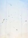
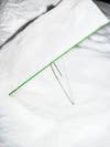
Sky
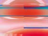
What are the images that appear to be streaked or distorted?
They are photographs taken with intentionally damaged memory cards. There is still a subject in front of the camera, the lens still collects light, but the information becomes scrambled.
How do you intentionally damage these memory cards?
Mostly with extremes of temperature.
Why do you use flash?
Firstly, flash acts as the control (in the scientific sense) in my experiment: every photograph is created with this same light source, thus any differences in colour result from the reflective nature of the subject matter (colour is reflected light). Secondly, I am trying to make images that are highly photographic, and as flash is unique to photography, it supports this endeavour. Finally, making photographs with light that is generated by the camera seems interesting in itself: a kind of photo-sonar.

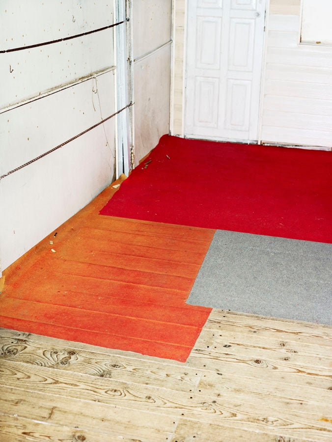
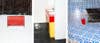
Office I
I’m curious to know more about the shot where you’ve shot a man from overhead, while he works at a brightly-colored yellow desk. How did that come about?
Early in the project I was seeking out flat planes of monochromatic colour – this photograph is a result. My camera viewpoint is known in cinematography as “The Eye of God” but in a modern city it is also the viewpoint of a surveillance camera.
What kind of effect are you looking to create with the captions for your images?
The titles nullify the viewer’s question: “What is it?” When that question is answered, the next question might be: “Why is it?”