Review: Apple Aperture 3
The latest version of Apple's RAW workflow tool has features for everyone.

We may earn revenue from the products available on this page and participate in affiliate programs. Learn more ›

PC users who want robust RAW workflow software with quality image processing have few options—in a relatively small field, Adobe’s Photoshop Lightroom 3 is the standout choice. But Mac users have a compelling alternative: Apple’s Aperture 3.
Though the first version of Aperture was released before the first version of Lightroom in 2005, the two have been fighting it out ever since. Both appeal to photographers who do most of their shooting in RAW and want to use a single program for organization, RAW adjustments, and output.
Not only is Aperture, at $200 (direct), less expensive than the $300 Lightroom, it has more to offer DSLR shooters whose primary audience is their friends and family. Besides its great controls for making sophisticated edits of RAW files, it includes quick, built-in methods for making photo books, trimming video clips, and creating multimedia slide shows—all tools that Lightroom lacks.

Beautiful Interface
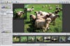
One of the best attributes of Aperture is its interface—Apple has, as usual, made design a priority. This time, it even made the icons across the top of the screen a little cuter. But what sets Aperture apart is the way it makes your pictures the visual centerpiece.
Unlike Lightroom (and many other editors, for that matter), the interface isn’t divided into separate modes—you don’t switch, for example, from Organizer mode to Edit mode. That means your screen and your preview don’t have to change every time you want to do something different. Aperture isn’t built around a linear workflow either, so you can quickly jump around from one task to the next.
On the left, there are three tabs for Library, Metadata, and Adjustments. Switch among those to organize or do some fixing. Choose from the Browser view to see a grid of thumbnails, the Viewer to see your images at maximum size, or the Split view to see a filmstrip at the bottom and your image on top.
In the latest version, Aperture’s full-screen mode has been improved. If you switch to it while in the Browser view, you’ll be able to sort your images with a minimum of surrounding clutter. If you go full-screen while in Split View or Viewer, your image takes up the entire display, and you can opt to access all your adjustments in a floating toolbar.
And now, if you hold down the Shift key while making a fix, everything but the slider you’re using fades from view. This is a great way to see how your picture will look after the adjustment.
Editing Improvements
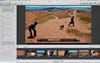
Apple has added some nice video capabilities to Aperture. Not only can you view all your HD video clips from within the browser, you can trim them and add them to slide shows. (Lightroom 3 previews the clips, but stops there.) This makes the program truly useful for DSLR shooters who make short videos to supplement, say, a travelogue.
Aperture flnally includes a fllter to reduce chromatic aberration, which users have been asking for since day one. You can apply it as a global fllter or brush it on with the new Brushes feature. This lets you apply or remove most of the other available adjustments to areas of your pictures, too.
Unfortunately, Brushes isn’t exactly intuitive to use. First, you make your adjustment, which functions as a preview. Then, when you click to brush the adjustment “in,” your adjustments disappear, then reappear where you paint. You can also choose to brush the adjustment “out” to remove it—the effect remains on your whole image, and the brush makes it go away.
Another long-requested tool that’s been added is a real version of Curves. You’ll especially appreciate it if you’re used to high-end image-editing software, and it works well. The only drawback? It lacks an RGB preview in the builtin histogram display.
Sharing Made Easy
With this release, Apple has added a few new features that, while useful for pros, will most likely appeal more to enthusiasts.
Faces, a beefed-up and slightly tweaked version of the iPhoto tool of the same name, is one of the most enjoyable, efflcient facerecognition software programs we’ve used. Because it’s so streamlined and fun, you might actually start tagging your pictures to make them easier to sort and to locate pictures of speciflc people. Click on the Faces icon on the top of the screen to search and tag people from the project you’re in; with no project selected, it will tag your entire library. This differentiation is not present in iPhoto, and will be particularly useful in Aperture for, say, wedding photographers who want to name just the members of that wedding party in their metadata.
Places, which is another tool from iPhoto, has similarly been spiffed up and added to Aperture. If your pictures contain location data, Aperture can automatically add your images to a map as pins.
Also built into this version of Aperture: Syncing with Facebook and Flickr. You no longer need software plug-ins for sharing. Once you set this up by inputting your account and password information, you’ll be able to upload to Facebook or Flickr simply by selecting a set of images and clicking the appropriate button. Facebook will ask you to choose your privacy settings (unfortunately, the only choices are to share with friends, friends of friends, or everyone—if you want more speciflc settings you’ll have to do that within Facebook itself). Then just click Publish. To add more images to that Facebook album, drag and drop into it. And since they’re synced, you can delete images this way, too. Flickr works similarly.
Apple, Apple, Apple
Steve Jobs & Company ensnare people with interconnected products, which can be both wonderful and infuriating. Wonderful when you love the products; annoying when you don’t. A perfect case in point: iPad syncing. Photographers who use their iPads as their portable portfolios will have a very good reason to consider Aperture, because adding albums of photos from Aperture to your iPad is a breeze. But if you use Lightroom, you’ll need to export your photos from there, then put them in a folder to sync to your iPad.
More bonuses for Apple aflcionados: If you use the Address Book to manage your contacts, Faces will suggest names based on your contacts. And if you do tag people who are contacts, their e-mail addresses will be linked up with their photos.
iPhone owners are also able to use their phones as GPS taggers. If you import your iPhone images, they can be automatically located on a map using Places. When you’re shooting with your DSLR, take a shot with your iPhone at all of your favorite locations. Then use Aperture to grab that location data and add it to a group of images from your DSLR. Do this during your whole trek, and you’ll have a complete geotagged map of where you’ve been.
Finally, if you sign up for MobileMe—Apple’s internet, syncing, and backup service—you can create web galleries and upload them straight from Aperture.
Still Not Perfect
Although we tested version 3.03, which flxed many of the bugs in Aperture 3’s initial release, we still had a few major crashes. Sometimes the image would hang up when loading, and no adjustment we made would preview. Restarting the program flxed the problem.
We liked the revamped import dialogue, which makes it easy to add metadata, to see where your pictures are going, and to do simultaneous backup. But there’s a strange quirk: While you can see all your subfolders if importing to Aperture from your computer’s hard drive, when you offload a memory card, the program only reads files that are located within the card’s DCIM folder. So if you make organizational subfolders within that folder, Aperture will bring all the images in at once. (To circumvent this problem, we just manually copied the images to our computer and imported them from there.)
We wish that the export dialogue were a little more robust, and hope that the next version of Aperture adds the ability to sharpen for export. Printing, while improved, still doesn’t quite stand up to Lightroom. When printing contact sheets or pages with multiple photos, you must preselect them—you can’t add them while making the layout.
Probably because Apple is not dedicated to imaging software, RAW updates can be a little slow in coming. We were frustrated that, at press time in mid-June, we couldn’t load RAW images from the Olympus Pen E-PL1 or the Panasonic Lumix DMC-G2, despite the fact that we could process them with Adobe Camera Raw. Apple suggested we try using Adobe’s DNG converter to add them in that format, but, at press time, we still couldn’t get our files to load.
The Buying Decision
Aperture occupies an unusual place in the RAW workflow world, having both pro-level RAW conversion with options like exporting 16-bit TIFF files and editing with Curves, and more consumer-level features like Facebook syncing and direct photo book creation.
As an Apple product, it’s already extremely specialized and will likely draw many of its users from the group of photo enthusiasts who love Apple software and want to move up from iPhoto.
If you’re a heavy Photoshop user and do lots of retouching, you would probably prefer Lightroom for its tight integration with Photoshop, particularly since its Camera Raw processing is exactly the same as Photoshop’s. For example, if you like to open a lot of RAW files as smart objects in Photoshop, you won’t be able to do so while keeping Aperture’s adjustments.
But if you would rather avoid Photoshop altogether, and especially if you want to make high-level RAW conversions but also want to make multimedia slide shows and book projects, Aperture is a great choice.