Flickr Trying New Photo Page Layout
Some users already seeing the new format
While some folks are might still be reeling from the massive redesign of Flickr earlier this year, it seems the company isn’t done tweaking the layout quite yet. Flickr is currently rolling out a redesigned version of the photo page itself, which is slowly being offered to more users.
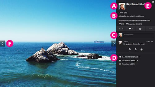
The primary change with the layout is to make the photo an even larger part of the screen, showing the image as big as possible. Here’s the rest of the layout, as explained by Flickr:
- Redesigned sidebar: We heard you loud and clear on this one! We’ve brought much more information above the fold, so you won’t have to scroll to see comments or other information about a photo.
- More intuitive controls: From this bar you can fave a photo, share it to your social networks, or perform other actions in the “dot dot dot” menu.
- Comments: Comments are now in reverse-chronological order (newest comment at the top) to make it easy to keep track of the latest comments on a photo. You can easily enter a new comment in the comment field and submit it by pressing Enter or Return.
- Information about the photo: If enabled by the photo owner, you can see the camera that took the photo and other EXIF data here. In addition, we are showing information about the photo settings, e.g. license, privacy, used. This is also where you can change the context you view your photo in, whether it’s a photostream, a set, a group, or other exciting areas on Flickr.
Users who are able to use the new layout should see a button allowing them to opt in to the redesign. If you’ve changed over, what do you think? Is this better than how it was before?
[via Reddit]