When Color Pops Up Where It Shouldn’t
I feel like I’ve been seeing early color photography all over the web in the last few months. It’s no...
I feel like I’ve been seeing early color photography all over the web in the last few months. It’s no surprise—that brief cognitive scramble that comes from seeing modern-day full-spectrum hues in something your brain expects to be black and white can be addicting. And it’s perfectly suited for the internet, where a sense of surprise is often critical for any single image to stand out enough to be admired or shared. Seeing these old anachronisms bubble up around the web always gets me thinking about how much color (or its absence) can change our perceptions in photographs.
A short list of recent highlights:
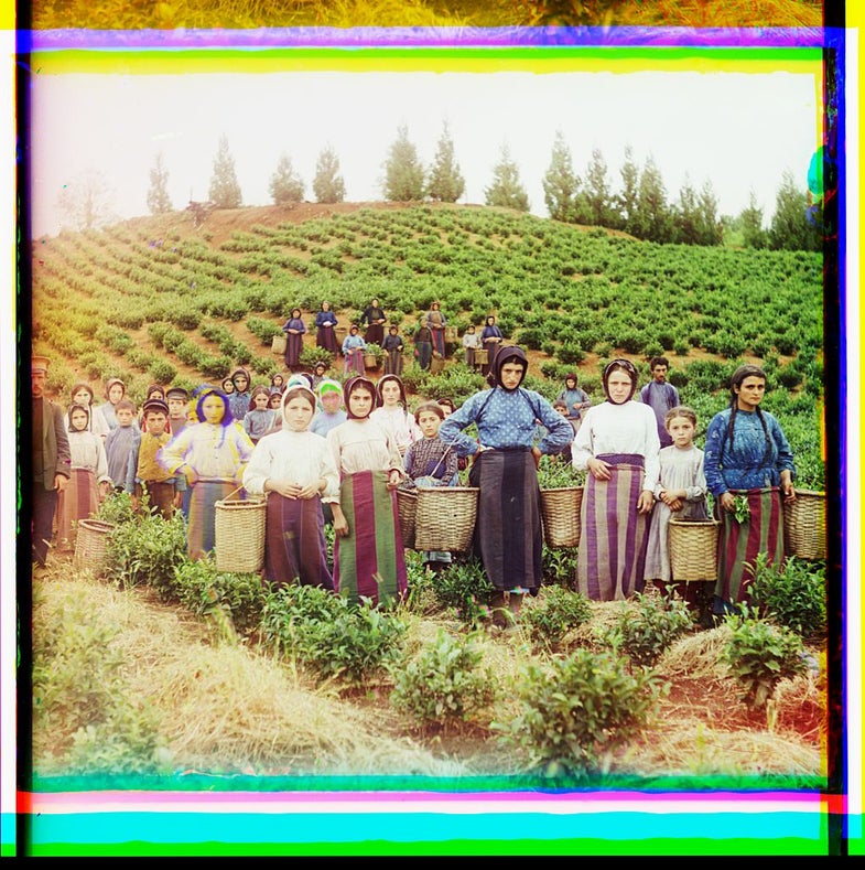
• Time’s LightBox blog featured a Library of Congress collection of photographs of Czarist Russia taken between 1909 and 1915 by Sergei Mikhailovich Prokudin-Gorskii, which was recently assembled in a book. Prokudin-Gorskii’s technique is interesting: he captured three black and white exposures per photo, each with a red, green, or blue filter. He then used lights of the corresponding colors to project the images for display, rendering them in color. You can lose a fair number of hours browsing the LOC collection, which is in the public domain here.
• Jason Kottke, also a fan of early color apparently, dug up some interesting photos of Paris circa WWI, on some Russian LiveJournal. They’re from a magnum opus of work commissioned as part of Albert Kahn’s ambitious The Archives of the Planet project, for which he sent hundreds of photographers around the world to document different cultures.
• The Smithsonian has a set of Civil-War era masters newly re-colorized by John C. Guntzelman for another new book. Even though the colorations are applied well after the fact, it looks like they’ve been done expertly, and the weird surreality of color in the past remains.
• A survey of American color photography on view at the Milwaukee Museum of Art begins with Lumiere autochromes from the turn of the 20th century. The New York Times has written this up along with other early color notables recently, including the Czarist Russia photographs.
It’s easy to start making grand, art-history-major type statements when you consider the role of color in our perception of a photograph’s reality. A question I find especially fascinating, and have no idea where the answer lies, is how these photos can impart a feeling of revelation—a feeling that we’re seeing something previously unseen—even when their content betray almost nothing about the historical time period in which they were taken?
Take this early glass-plate color photograph taken by Sarah Angelina Acland from around 1909, part of the Times’s survey:

A glass-plate color exposure from 1909
You could point to the masts of the sailing ships in the harbor, perhaps, but one look at this photo and you know it’s old, despite a lack of any firm tip-offs in its content. The moment that realization morphs into this is in color is where the fun begins. It’s not unlike the appeal of Instagram filters, which can take something shot with a futuristic cameraphone in 2013 and (attempt) to fool our brains into placing it into another era. These photographs are the real deal, though, and to me, their power (even the colorizations) resonates far beyond their “filter”—they’re starting with a level of authenticity that’s impossible to fake, even with the best digital simulation. As of now, anyway!