Master Class: Pete Turner
How jazz helped define the work of a legendary colorist.
Photographers like to say that their medium’s closest artistic equivalent is music. That assertion has more to do with their fondness for tunes — many of them are frustrated musicians — than with any critical rationale. But if any photographer’s work bears comparison to music, the most abstract of all the arts, it is Pete Turner’s. In Turner’s highly graphic, supersaturated images, color and form are analogous to pitch and meter, and almost disembodied from physical substance — like music, pure wavelengths of energy.
So it’s no surprise that early in Turner’s remarkable five-decade career, he made such a meaningful connection with the musical world. It began with the photographer’s habit of searching New York City record bins for jazz albums. The cover art he saw was unremarkable, and he was determined to show his portfolio to jazz producer Creed Taylor, whose name always seemed to be associated with the most interesting recordings. The two met in 1958, and with that pivotal encounter began a long-term collaboration that produced more than 100 jazz albums known for both their music and their artwork. Many of these albums are now highly collectible.
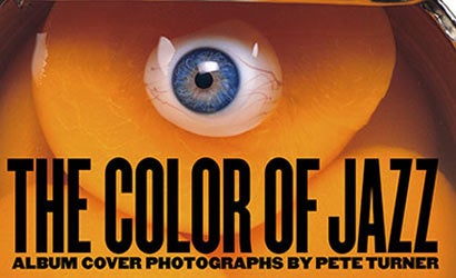
The best of Turner’s classic album photographs are gathered in his third monograph, The Color of Jazz (Rizzoli, $45), which includes a foreword by music legend Quincy Jones and an afterword by Creed Taylor, who recorded jazz greats from Charles Mingus to Wes Montgomery. Concurrent with the book’s publication, the George Eastman House museum in Rochester, New York, will be the venue for an extraordinary retrospective, “Pete Turner: Empowered by Color,” running through February 4, 2007. The show will feature specially made Epson inkjet prints lighted with a unique system that gives them all the intensity that Turner envisioned. (More about that later.)
Pete Turner was creating his highly manipulated images long before the advent of digital capture and image-editing software. In 1957, while in the Army, he was assigned to run the newly developed Type-C color lab that had just been installed in a New York military facility. Turner spent his off hours trolling Manhattan’s environs and photographing projects that he devised for himself. These ranged from the reflections of neon signage on wet pavement to the clusters of balloons that vendors sold in Central Park. “I was a vacuum for color,” Turner recalls, “and I built up my portfolio this way.
Those pictures were the starting point for Turner’s collaboration with Creed, and the album covers they graced broke with the custom of a static portrait of the featured musician. “Photography was pretty straight then,” says Turner. “Even using a polarizer to pump up the color was a big deal.” Inspired by Creed’s assignments, the photographer developed a style that included the use of color to create mood, shooting from low angles, selective focus, blurry extreme close-ups, and in-camera double exposures. Yet Turner’s work for Taylor wasn’t the usual strict assignment photography; he was only given a proposed album title, and rarely heard the music before shooting. That meant he could be as interpretive as he liked.
In addition to the assignments, Turner and Taylor pored through Turner’s image archive for album cover material. They had images with incredible color to choose from, due in part to a technique that Turner had devised out of necessity. “My original slides were always being returned from the likes of Look and Esquire magazines all scratched and beat up,” he recalls. In order to preserve the originals, Turner began making copies with a slide duplicator. He realized that when he duped his Kodachrome originals back onto Kodachrome, and added filtration to change their hues, the copy slides had higher contrast and the intense color he wanted. “The results were so exciting,” says Turner. “The photos looked better and the response to my work kept growing.
Today’s digital imaging technology seems made to order for Turner’s purposes, and he has embraced it fully. He shoots with a Nikon D2X digital SLR on Lexar Professional CompactFlash cards. He has been using the Beta version of Adobe’s Lightroom software to manage and manipulate his images. “Lightroom is an electronic darkroom, pure and simple,” he says. “It’s a virtual stripped-down Photoshop that’s easy to use, works well on my PowerBook, and creates an excellent workflow.
Turner is making his prints on Epson Stylus Pro printers. As with many photographers who once depended on photo labs to process and print their color work, digital output has given Turner an unprecedented level of creative control. “I don’t have to outsource my printing anymore,” states Turner. “Though I consider myself a perfectionist, I’m always amazed at the first test print results. And if necessary, I can quickly tweak anything in a matter of minutes.” Turner is particularly impressed with Epson’s pigment-based UltraChrome inks. “In addition to their incredible longevity, they have a vibrancy and the most liquid color I’ve ever seen. In the past, pigments blocked up across the board, but these have a transparency to them. It’s as if these inks pour light onto the paper.” Turner finds that Epson’s Premium Luster Photo Paper is perfectly suited to the K3 inks. “It’s the closest I’ve seen to the dye transfer paper of the past. I’m very excited about the prints I’m producing today.”
To do justice to the more than 50 large-scale prints that will appear in Turner’s Eastman House show, Turner and the team of Sean Corcoran, the museum’s assistant curator of Photographs, Rick Hock, director of exhibitions, and Dan Steinhardt, photographic marketing manager of Epson America, chose 4100K SoLux bulbs that are considered ideal for lighting color photographs in display settings. “Each print will be dramatically spotlit like a gem,” says the photographer. “I couldn’t ask for a better presentation.”
As always, Turner seeks photographic inspiration wherever he happens to be, whether in the studio or on the road. “People are assaulted with visual distractions,” he says. “My job is to intensify the experience of color for them. I’m just happy to know that people like what I’ve done, and what I’m still doing.
Turner on color: “Color takes my work into another dimension. It’s the way I see. I’ve always been drawn to the colors of nature, and nature is a wonderful teacher. Look at the color coding of a bee — yellow and black stripes — or of a cardinal with its different shades of red. It is rare that nature is not in color harmony. Go out there and look. Although a lot of my pictures are not taken from nature, I use nature as a color source.
On controlling color: “Make color work for you, and keep it simple. I always look at my subject and work at incorporating mood. An example is the blue mood of dawn with the traffic light and Empire State Building [page 39]. All the light is in balance. If the cheetah [page 38] had a red area in it, your eye would land ?on that distraction and the mood would fail. The color integration of the cheetah and the bamboo simplifies the image and makes it work.”