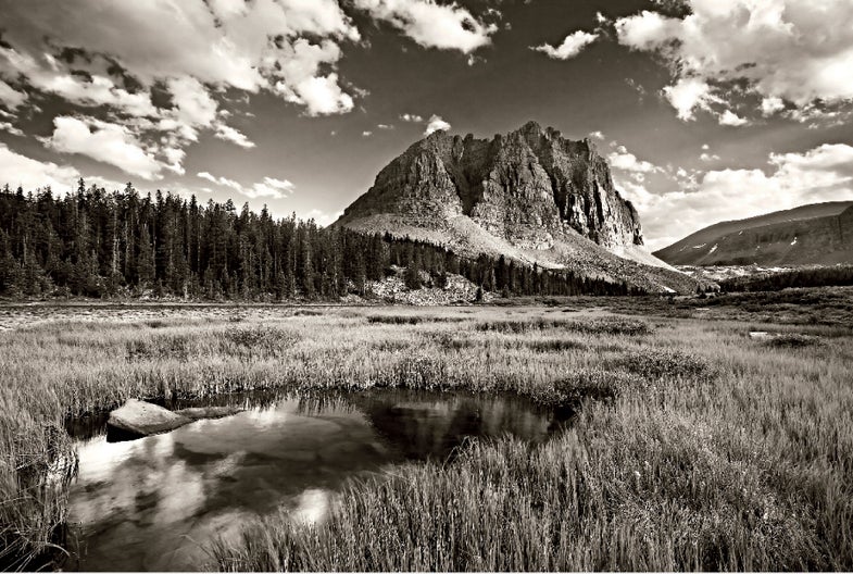
How To: Shooting in Earth Tones
Channel your inner Ansel Adams with dramatic black-and-white landscapes.
Earth Tones
When people talk about “fine-art photography,” they usually mean that recording subjects and scenes takes a backseat to aesthetics and personal interpretation.
Black-and-white is perfect for this. You’re free to render almost any subject in almost any shade without regard to color accuracy, and to exploit graphic elements such as tone, lines, textures, and details. You can imbue an image with a mood of your own choosing, free from the emotional associations some colors carry. And, for many of us, there is an undeniable romantic appeal to monochrome images.
While digital offers much of the same capabilities as traditional b&w film photography, it allows more precise control. Here are some steps to creating your own fine-art monochromes.
Step 1: VISUALIZE TONES
Ansel Adams described visualization as seeing in your mind’s eye the finished image before actually making an exposure. A useful skill for any photographer, it becomes all the more critical in black-and-white. Your final image will be rendered in tones, or degrees of brightness, rather than in individual colors. This means different colors (say, red flowers and green leaves) may appear the exact same shade of gray when transformed into b&w.
To successfully visualize in monochrome, ignore color and pay attention only to differences in brightness. With some practice you’ll be able to tell how different elements in your composition will appear relative to each other.
Tonal differences are referred to in terms of separation and contrast. If one element is significantly brighter or darker than another, contrast is high, and the elements will be well separated when rendered in b&w. Where contrast is low and elements have similar tones, they will tend to mesh together and not separate very well.
Step 2: UNDERSTAND FILTERS
Color can still be put to good use in b&w by using color filters. These allow light only of their own hue to pass through, blocking others. Opposites on the color wheel will show the strongest separation: A red filter will block most of the green and blue ranges, and can thus produce a striking separation between a red flower and green leaves. A red filter can also render a blue sky almost completely black, making clouds stand out boldly. And a green filter makes foliage appear bright, helping to separate leaves from dark branches and trunks.
Photographers used to have to carry color filters with them and decide on the spot when to use them. If you’re shooting digital, though, you can create the same effects with software such as Adobe Photoshop. You can apply any amount of filtration, and also blend the effects of multiple filters. And you can see the results in real time on a large colorcalibrated monitor before deciding on the right look.
Step 3: CONVERT TO MONOCHROME
If you have Photoshop CS3 or later, you can use the versatile Black & White adjustment layer. This allows you not only to convert your color image, but also to select from a number of filter presets, and adjust the blending amounts of various colors and shades.
Have an older version of Photoshop? Instead, use the Channel Mixer adjustment layer by checking the Monochrome box and adjusting the percentage of each color channel used in the conversion. For example, 100% of the Red channel and 0% of the Blue and Green channels is equivalent to a red filter effect. I don’t recommend converting the image using the Grayscale mode, as this will discard its original color information. (For the same reason I don’t recommend using the b&w modes built into most digital cameras.)
Step 4:****SHOOT RAW FILES FOR THE BEST RESULTS
Fine adjustments are much easier to apply when converting from RAW in the digital darkroom, rather than making decisions in the field based on readings in the camera’s LCD.
Take white balance, for instance. You may think that WB during processing is irrelevant when you’re converting to b&w, but that’s not so. Varying the WB setting also varies the relative amounts of red, green, and blue used to render each pixel. Thus, an image with an overall blue cast will appear dark if you use a red filter when converting to b&w, or bright if you use a blue filter.
In extreme situations, individual color channels may be clipped-a clipped red channel, for example, will result in loss of shadow or highlight detail if the image is converted to b&w using either a red or blue filter.
Varying the WB setting can direct more image detail to a clipped channel from a nonclipped one. You can see this effect by watching how the individual color histograms change relative to each other under different color temperatures or WB presets. To keep a color channel from clipping, make sure that its individual histogram does not spill over the left or right edge.
Yet another reason I recommend capturing RAW instead of JPEG images in the field? If your camera has a b&w setting, shooting RAW lets you see a monochromatic preview in the LCD without actually losing the benefits of all that color information.